# What is Heuristic Evaluation
启发式评估
Performed by an Expert
由专家进行Steps
- Inspect UI thoroughly
彻底检查用户界面 - Compare UI against heuristics
启发式地比较用户界面 - List usability problems
列出可用性问题 - Explain and justify each problem with heuristics
用启发式方法解释并论证每个问题 - Provide a possible solution to the identified issue
为已发现的问题提供可能的解决方案
- Inspect UI thoroughly
Method
- Expert evaluates the user interface using guidelines
专家根据准则评估用户界面 - Usability "inspection" method
可用性 “检查” 方法- Depends on evaluator's judgment
取决于评估者的判断
- Depends on evaluator's judgment
- Is a "discount" usability engineering method
是 “折扣” 可用性工程方法- One case study found factor of 48 in cost/benefit:
研究发现成本 / 收益比为 48- Cost of inspection: $10,500. Benefit: $500,000 (Nielsen, 1994)
检查费用:$ 10,500。 收益:$ 500,000
- Cost of inspection: $10,500. Benefit: $500,000 (Nielsen, 1994)
- One case study found factor of 48 in cost/benefit:
- Expert evaluates the user interface using guidelines
# How to do Heuristic Evaluation
如何进行启发式评估
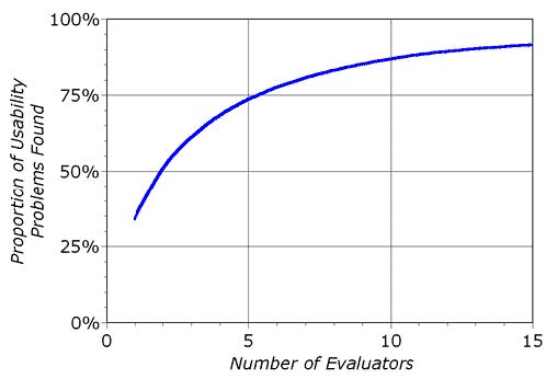
- Systematic inspection of system
系统检查 - Multiple evaluators are better
多个评估者为佳 - Trained evaluators are better
训练有素的评估者为佳- 22% vs. 41% vs. 60% of errors found
- Go through whole interface
贯穿整个界面 - Result: list of problems, guidelines violated, and proposed fixes
结果:问题清单,违反的准则,以及修正建议
# HE is not UT
- Evaluator is not the user
评估者不是用户 - Analogy: Code inspection Vs Testing
类比:代码检查与测试 - HE often finds problems that UT misses
HE 经常发现 UT 遗漏的问题- Inconsistent fonts
字体不一致 - Size and distance (Fitt's law problems)
大小和距离(菲特定律问题)
- Inconsistent fonts
- But UT is standard for usability
但是 UT 是可用性的标准
# How many Evaluators 需要几位评估者
Nielsen suggests optimal might be 4
# HE Methodology 方法论
- Reference: Nielsen's "How to Conduct a Heuristic Evaluation"
如何进行启发式评估- Each evaluator inspects interface separately
每个评估员分别检查界面 - OK for designer to answer evaluator's questions
可以让设计师回答评估者的问题 - Go through interface several times using heuristics
使用启发式方法多次浏览界面 - Can supply evaluators with scenarios of user tasks
可以为评估人员提供用户任务方案
- Each evaluator inspects interface separately
# Guidelines guide design 准则指导设计
- Knowing these guidelines should improve your designs
了解这些准则,可以改善你的设计 - Take them into account to avoid violating them
考虑到这些,避免再次违规 - Also, all the other guidelines
此外,所有其他准则- Guidelines for mobile, international, web etc.
移动,国际,网络等准则
- Guidelines for mobile, international, web etc.
- Neilsen evaluated 60 old guidelines (in 2005) and found 90% still valid after 20 years
2005 年 Neilsen 评估了 60 条旧指南,发现 90%在 20 年后仍然有效- Others no longer relevant, only 2 were "wrong"
- http://www.useit.com/alertbox/20050117.html
- Similarly with web guidelines: http://www.nngroup.com/articles/usability-guidelines-change/
# 10 Basic Principles 尼尔森十大可用性原则
From Nielsen's web page: http://www.useit.com/papers/heuristic/heuristic_list.html
- Visibility of system status
系统状态的可见性 - Match between system and the real world
系统与现实世界之间的匹配,环境贴切原则 - User control and freedom
用户的控制性和自由度 - Consistency and standards
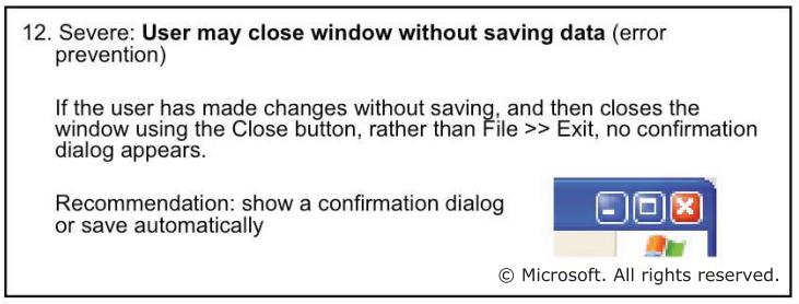
一致性和标准化 - Error prevention
错误预防 - Recognition rather than recall
识别,而不是记忆 - Flexibility and efficiency of use
灵活性和使用效率 - Aesthetic and minimalist design
美观和简约的设计 - Help users recognize, diagnose, and recover from errors
帮助用户识别,诊断错误,并从错误中恢复 - Help and Documentation
帮助和文档
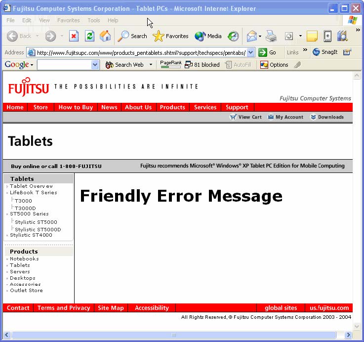
# 1️⃣ Visibility of System Status
系统状态的可见性
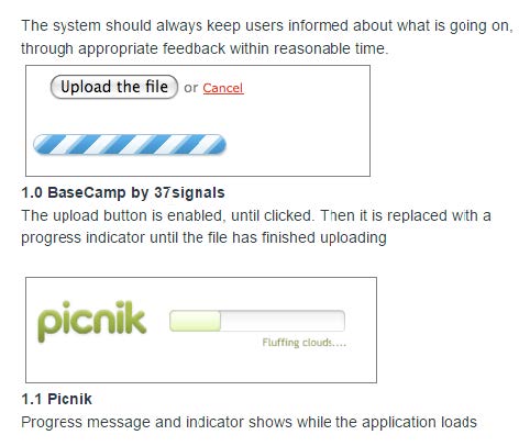
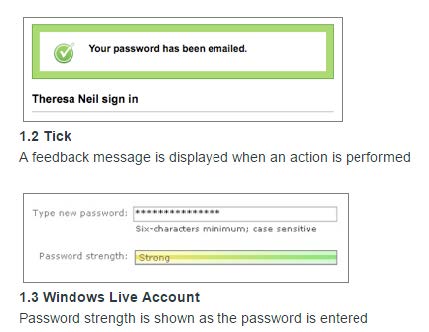
- Keep users informed about what is going on
让用户知道发生了什么事 - What page they are on and what part of a process
他们在什么页面上以及过程的哪个部分 - Provide appropriate feedback
提供适当的反馈- About what system is doing, and how input is being interpreted
关于系统在做什么,以及输入如何被解析 - E.g. in XXX product, 例如 在 XXX 产品中,
- "really ungroup?" “真的要取消分组?”
- loses associated behavior 失去相关行为
- About what system is doing, and how input is being interpreted
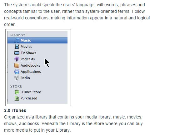
# 2️⃣ Match between System And the Real World
系统与现实世界之间的匹配,环境贴切原则
- Terminology in user's language
术语基于用户语言- Not computer terminology
不是计算机术语
- Not computer terminology
- Language from user's perspective
用户角度的语言- "You have bought…" not "We have sold you…"
“您买了……” 而不是 “我们卖给了您……”
- "You have bought…" not "We have sold you…"
- Use common words,not "techno-jargon"
使用常用字词,不要使用 “技术术语” - Error messages and feedback refer to user objects
错误消息和反馈涉及用户对象 - Allow full-length names
允许使用全名 - E.g. "Hit any key to continue"
例如 “按任意键继续”
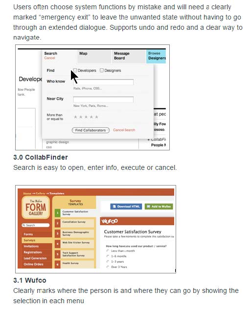
# 3️⃣ User Control and Freedom
用户的控制性和自由度
- Easy to abort: Cancel buttons
容易中止:取消按钮- Cancel order, cancel changing a profile
取消订单,取消更改个人资料
- Cancel order, cancel changing a profile
- Easy to Undo
容易撤消- Web issue: what does "Back" button do?
网络问题:“返回” 按钮有什么作用?- Example: many sites can get confused if use back button
示例:如果使用 “后退” 按钮,许多网站可能会感到困惑
- Example: many sites can get confused if use back button
- Web issue: what does "Back" button do?
- Users (even experts) will make errors
用户(甚至专家)都会出错 - E.g. in XXX product,
例如 在 XXX 产品中,- no way to get out of editing a text field
没有退出编辑文本字段的方法
- no way to get out of editing a text field
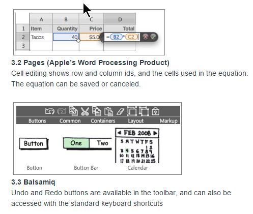
# 4️⃣ Consistency and Standards
一致性和标准化
- Same command always have the same effect
相同的命令始终具有相同的效果 - Locations for information, names of commands
信息位置,命令名称 - Give the user a mental model of the system
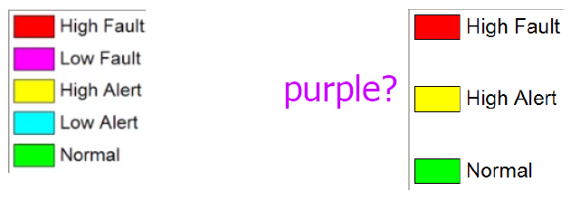
为用户提供系统的心理模型 - Size, location, color, wording, function, sequencing, etc.
大小,位置,颜色,措辞,功能,排序等。- E.g., color purple?
例如,紫色?
- E.g., color purple?
- Following standards helps
遵循标准有助于- Web: use templates or CSS, style guides
网络:使用模板或 CSS,样式指南
- Web: use templates or CSS, style guides
- Seems easy, but often not followed; e.g. in XXX
似乎很容易,但常常没有遵循; 例如 在 XXX 中- naming "F#1.C#1" vs. "F#1", "C#1"
命名方式:“F#1.C#1” VS.“F#1”,“C#1” - consistent with industry standards: e.g., Copy
符合行业标准:例如,复制
- naming "F#1.C#1" vs. "F#1", "C#1"
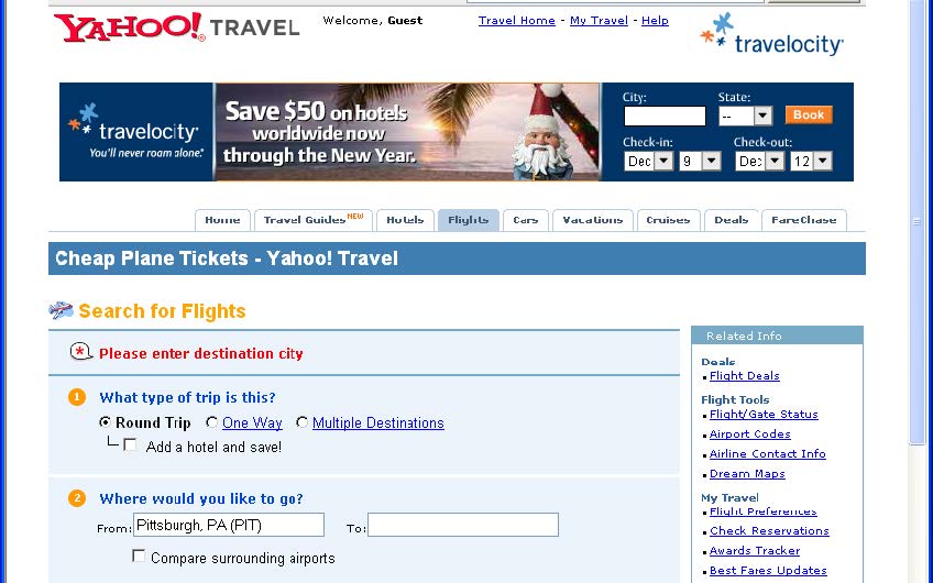
# 5️⃣ Error Prevention
错误预防
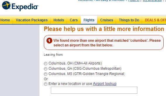
- Selection rather than entry
选择而不是输入- www.Expedia.com: question, when ambiguous city (e.g. Columbus)
问题,当城市模棱两可时(例如哥伦布)
- www.Expedia.com: question, when ambiguous city (e.g. Columbus)
- Remove or gray-out illegal choices
删除或灰化非法选择- Not common for web pages
网页不常见
- Not common for web pages
- Auto-fill in
自动填写 - Confirmation
确认 - Avoid modes
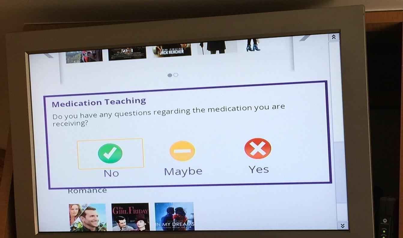
避免模式- Definition: same user action has different results
定义:同一用户操作具有不同结果 - Make unavoidable modes visible like ^F for Outlook
使不可避免的模式,如 Outlook 的 Ctrl+F - E.g. Typing "daytime" to a mail program
例如 在邮件程序上键入 “白天”
- Definition: same user action has different results
# 6️⃣ Recognition rather than Recall
识别,而不是记忆
- Make objects, actions, options visible
使对象、动作、选项可见 - See and pick it, not generate it
查看并选择它,而不生成它 - Short-term memory = 7 ±2 items; 30 sec to 2 min
短期记忆 = 7±2 个项目; 30 秒至 2 分钟。超过 7 个会遗忘- unless interrupted
除非被打断
- unless interrupted
- Menus rather than type-in (but short enough)
菜单而非键入(但足够简短) - Auto-fill in helps here too
自动填写也有帮助 - Prompts provide format and limits
提示支持的格式和限制 - Don't require retyping of remembered information
不需要重新输入记住的信息 - Pervasive, generic rules (cut/paste)
普遍的通用规则(剪切 / 粘贴) - E.g. in Aegis, remembering altitude
例如 在宙斯盾,海拔高度


# 7️⃣ Flexibility and Efficiency of use
灵活性和使用效率
- Provide Shortcuts
提供捷径 - For experienced users
针对经验丰富的用户- E.g., Command keys
例如,命令键
- E.g., Command keys
- Jump directly to desired location
直接跳到所需位置 - Reuse previously entered information
重复使用以前输入的信息 - Good default values
良好的默认值
# 8️⃣ Aesthetic and Minimalist Design
美观和简约的设计
- Good Graphic Design and Color Choice
良好的图形设计和色彩选择- Appropriately direct attention
适当的直接关注 - Group related objects (alignment, decorations)
分组相关对象(对齐,装饰) - Balance and white space
平衡和空白 - Maintain display inertia
保持显示惯性 - Few fonts and colors (5 to 7 colors)
几种字体和颜色(5 至 7 种颜色)- Appropriate contrast
适当的对比 - Some people are color blind (8% of males)
有些人色盲(男性的 8%)
- Appropriate contrast
- Appropriately direct attention


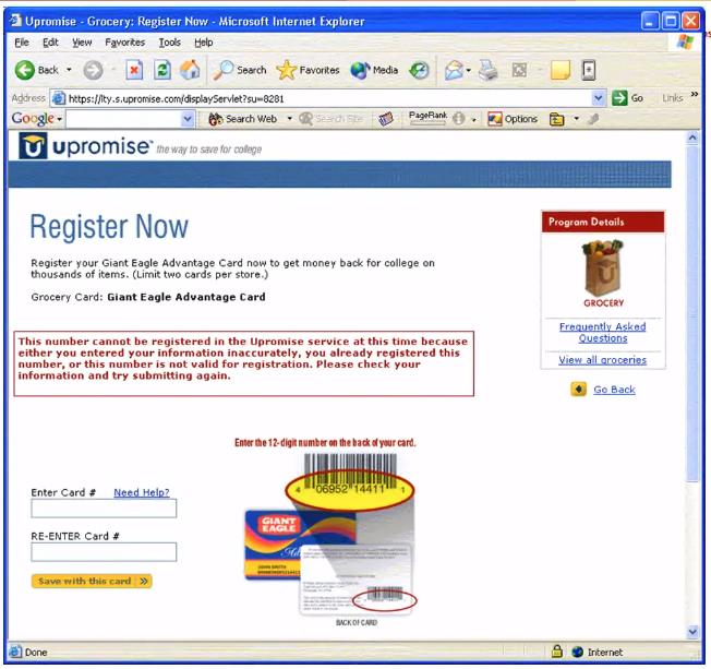
# 9️⃣ Help Users Recover from Errors
帮助用户从错误中恢复
- Help users when they are in trouble
遇到麻烦时帮助用户 - Opportunities for users to learn about the system
用户学习系统的机会 - Clear language; no codes
语言清晰; 不要错误代码 - Be precise; Not "syntax error"
要精确; 不是 “语法错误” - Constructively help the user solve the problem
建设性地帮助用户解决问题- Tell why the error happened and how to fix it
指出错误发生的原因以及解决方法
- Tell why the error happened and how to fix it
- Be polite and not accusing; positive wording:
有礼貌,不要指责; 正面措辞:- Not: "FATAL ERROR", etc.
- 而不是:“致命错误” 等。

# Error Messages 错误信息
- Blame the system, not the user
要责怪系统,而不是用户- "Unrecognized" vs. "illegal" command
“无法识别” 与 “非法” 命令
- "Unrecognized" vs. "illegal" command
- No humor or snide comments
不要幽默的评论 - Easy error recovery
能轻松恢复 - Can have multiple levels of messages
可以有多个级别的消息- E.g. in XXX product, "can't save file" —why not?
例如 在 XXX 产品中,“无法保存文件”- 为什么不呢?
- E.g. in XXX product, "can't save file" —why not?
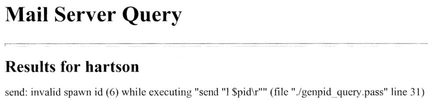
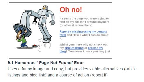
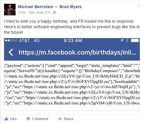
# Bad Error Messages
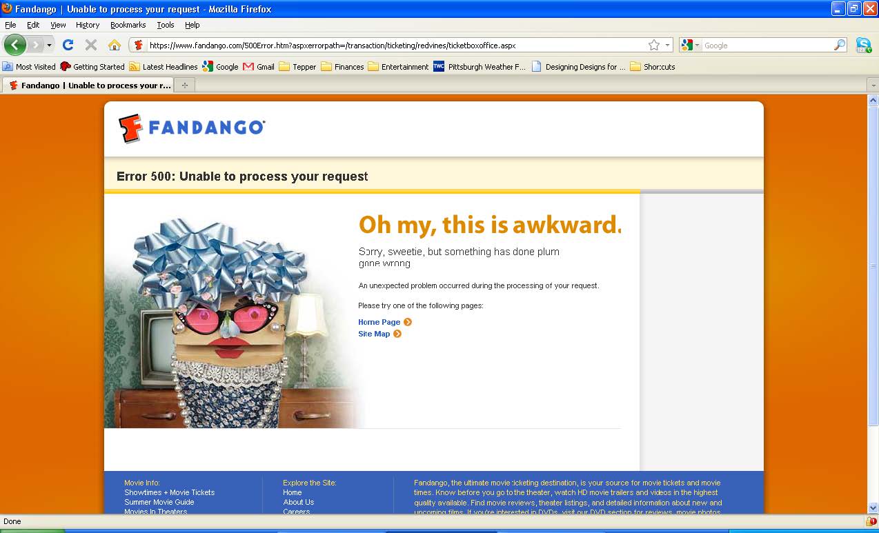
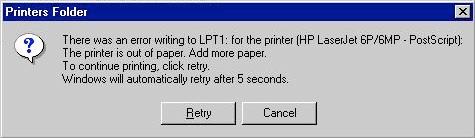
# Pretty good Example
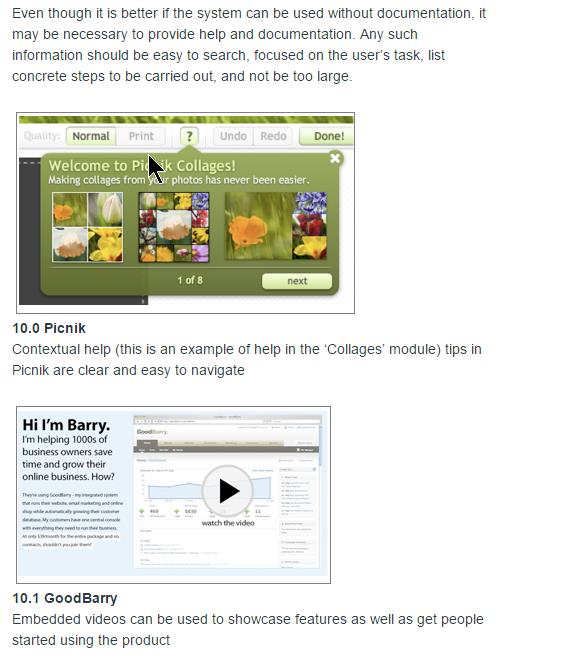
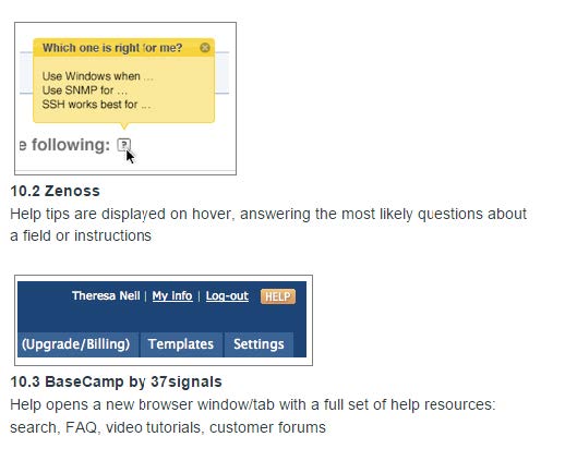
# 🔟 Help and Documentation
True walk up and use?
真正的运行和使用?Most people will not read documentation
大多数人不会阅读文档- If do, then
如果这样做,那么- First time product is used, or else
首次使用产品,否则 - In a panic, so need information right away
出现紧急情况,因此需要立即提供信息
- First time product is used, or else
- If do, then
Iterative design of documentation needed
所需文档的迭代设计- SuperBook application answer found in 4.3 minutes, compared to 7.6 minutes before fixing
在 4.3 分钟内找到 SuperBook 应用程序答案,而修复前为 7.6 分钟
- SuperBook application answer found in 4.3 minutes, compared to 7.6 minutes before fixing
Help system is an extra feature to learn
帮助系统是需要学习的额外功能"Help doesn't help"
“帮助无济于事”- If need to add help, maybe fix the feature?
如果需要添加帮助,也许可以修复该功能? - Use documentation writers to help refine the system
使用文档编写者来帮助完善系统
- If need to add help, maybe fix the feature?
Good quality writing
高质量的写作
# Example
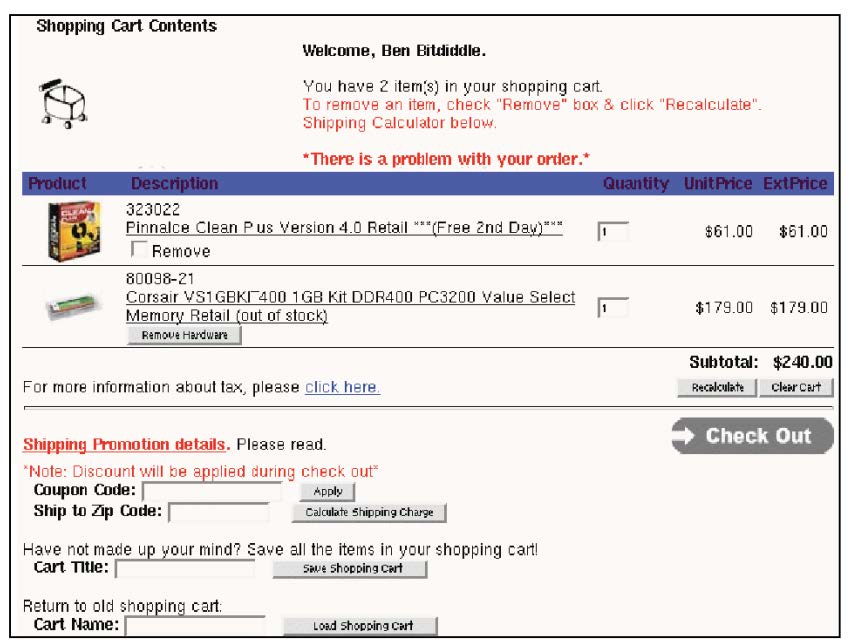
- Shopping cart icon is not balanced with its background whitespace (graphic design)
- Good: user is greeted by name (feedback)
- Red is used both for help messages and for error messages (consistency, match real world)
- "There is a problem with your order", but no explanation or suggestions for resolution (error reporting)
- ExtPriceand UnitPriceare strange labels (match real world)
- Remove Hardware button inconsistent with Remove checkbox (consistency)
- "Click here" is unnecessary (simplicity)
- No "Continue shopping" button (user control & freedom)
- Recalculate is very close to Clear Cart (error prevention)
- "Check Out" button doesn’t look like other buttons (consistency, both internal & external)
- Uses "Cart Title" and "Cart Name" for the same concept (consistency)
- Must recall and type in cart title to load (recognition not recall, error prevention, efficiency)
# Hints for better HE
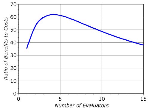
- Use multiple evaluators
使用多个评估者- Different evaluators find different problems
不同的评估者发现不同的问题 - The more the better but diminishing returns
越多越好,但递减 - Neilsen recommends 3-5
尼尔森建议 3-5
- Different evaluators find different problems
- Alternate HE with UT
用 UT 替代 HE- Each method finds different problems
每种方法都会发现不同的问题 - HE is cheaper
HE 便宜
- Each method finds different problems
- Its OK for observer to help evaluator
可以让观察者帮助评估者- As long as the problem has already been noted
只要问题已经指出 - This would not be OK in a UT
在 UT 中这不行
- As long as the problem has already been noted
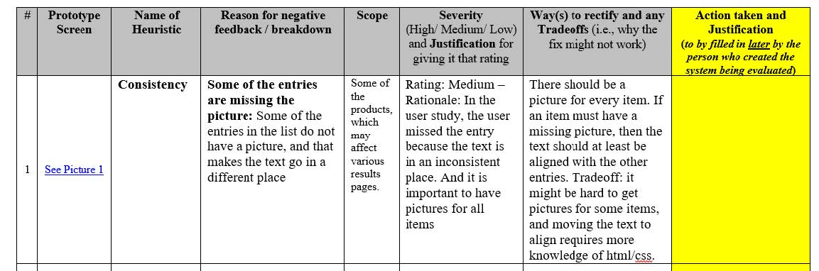
# Suggested Report Format What to include
建议的报告格式
What to include
- Problem 问题
- Heuristics 启发式
- Description 说明
- Severity 严重程度
- Recommendation (if any) 推荐(如果有)
- Screen Shots 屏幕截图