# Aesthetics in HCI
人机交互中的美学
Traditional emphasis on usability is now giving way to include user experience as a measure of good UI design.
传统上对可用性的强调正逐渐让位,包括用户体验在内,作为衡量良好 UI 设计的方法。
# Various Movements in Art
各种艺术运动
| Greek and Roman | 希腊和罗马 |
| Medieval | 中世纪 |
| Renaissance | 文艺复兴 |
| Baroque | 巴洛克式 |
| Neo Classical | 新古典 |
| Realism | 现实主义 |
| Impressionism | 印象派 |
| Cubism | 立体主义 |
| Abstract Art | 抽象艺术 |
# Golden Proportions 黄金比例
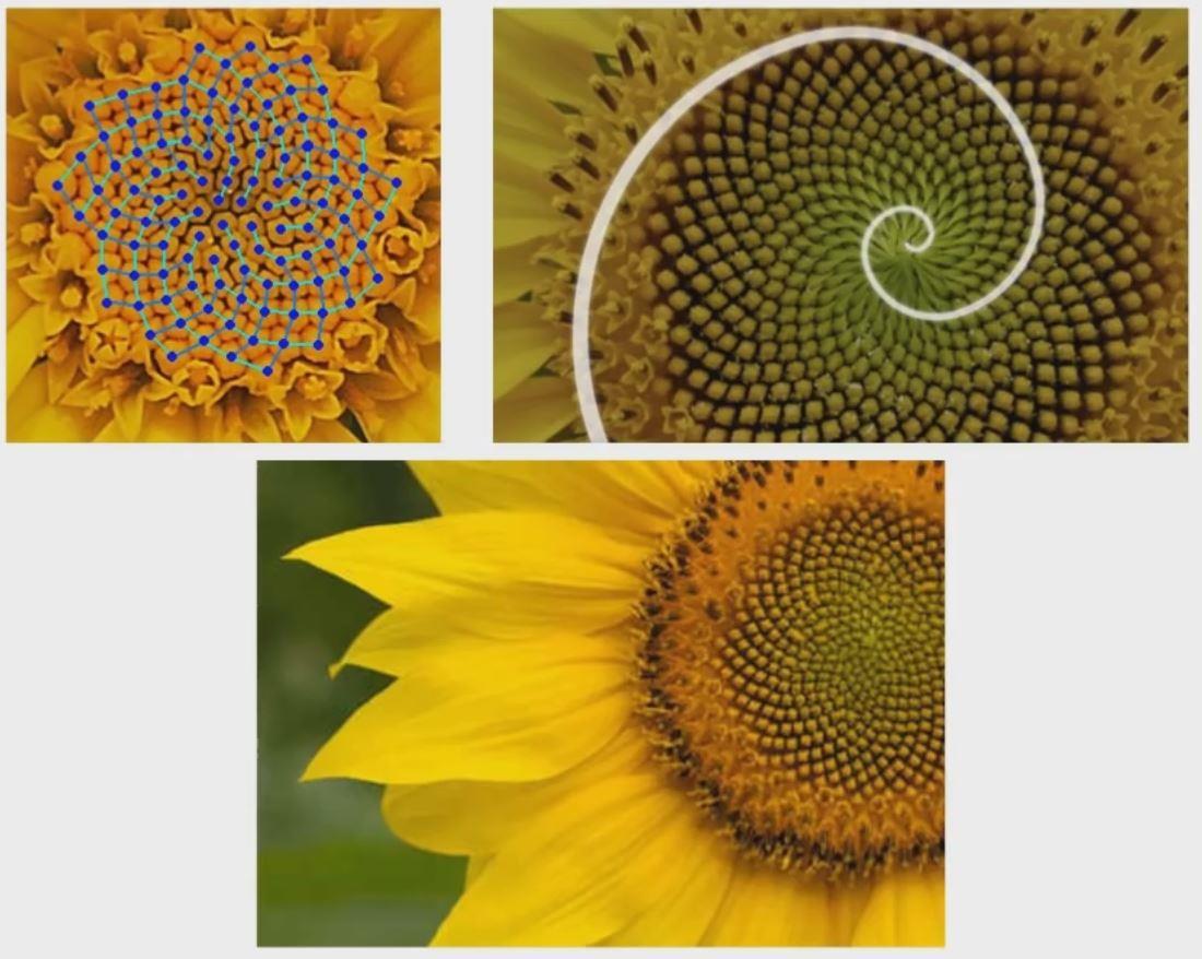
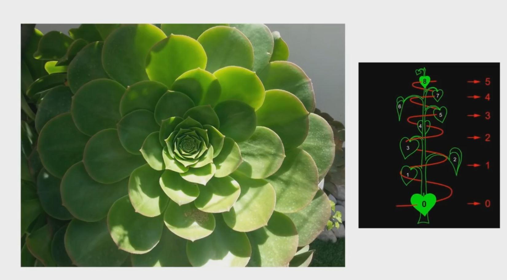
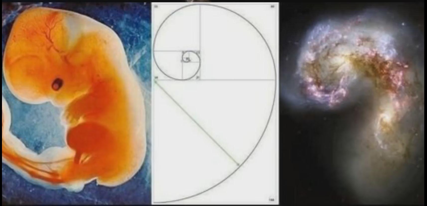
Golden proportions are found both in nature and in man-made structures
在自然界和人造结构中都可以找到黄金比例
- Studies have shown that humans have a preference for Golden Proportions
研究表明,人类偏爱黄金比例 - Golden proportions consist of the golden ratio and are closely related to Fibonacci sequence
黄金比例由黄金分割率组成,与斐波那契数列密切相关- The golden ratio is one where the ratio of the smaller segment to the larger segment is the same as the larger segment to the sum of both segments.
黄金分割率是较小部分与较大部分之比,与较大部分与两个部分之和之比相同的比率。 - The golden proportion is a visual representation of the golden number (Φ) which is approximately 1.618
黄金比例是黄金分割数(Φ)的视觉表示,约为 1.618
- The golden ratio is one where the ratio of the smaller segment to the larger segment is the same as the larger segment to the sum of both segments.

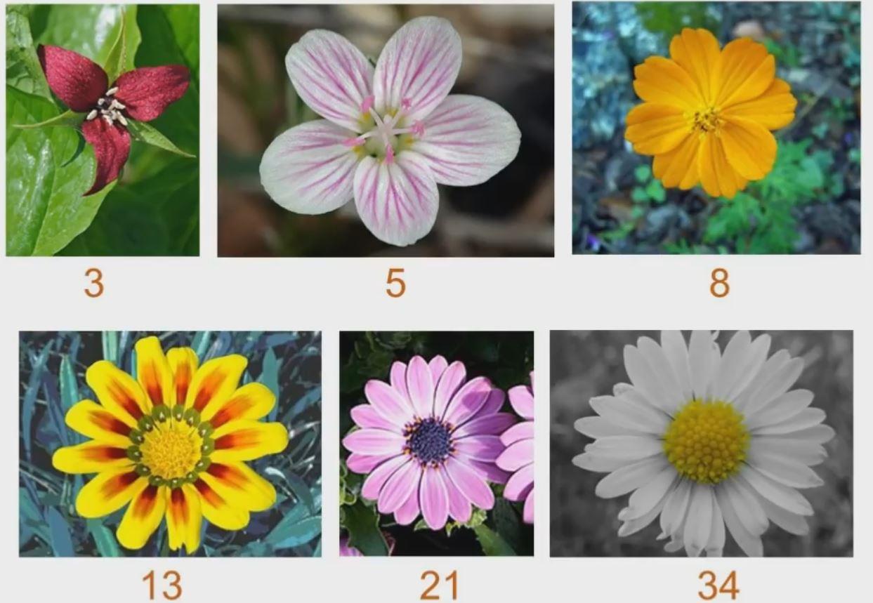
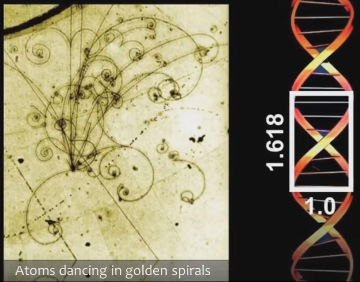
# Fibonacci Sequence 斐波那契数列
The golden ratio is closely connected to Fibonacci sequence
黄金比例与斐波那契数列紧密相关
- Fibonacci sequence begins by definition with the numbers 0, 1 and then each successive number in the sequence is the sum of the previous two numbers
斐波那契数列的定义是从数字 0、1 开始,然后序列中的每个连续数字都是前两个数字的和0,1,1,2,3,5,8,13,21,34,55..... - If you take any number in the sequence and divide it by the previous number the result approximates Phi or the golden ratio
如果将序列中的任何数字除以前一个数字,则结果近似为 Φ 或黄金比例13/8 = 1.62521/13 - 1.61534/21 - 1.61955/34 = 1.6176 - This sequence is found all around us in nature
在自然界中发现了这个序列

# Golden Ratio and the rule of third 黄金分割率与三分法则
Video: The Golden Ratio vs. The Rule of Thirds
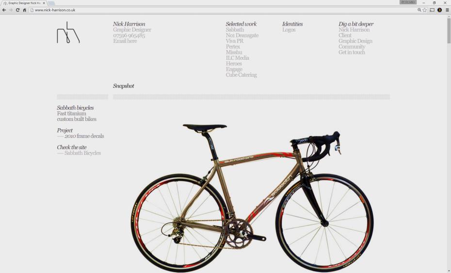
# Example

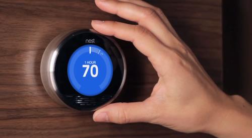
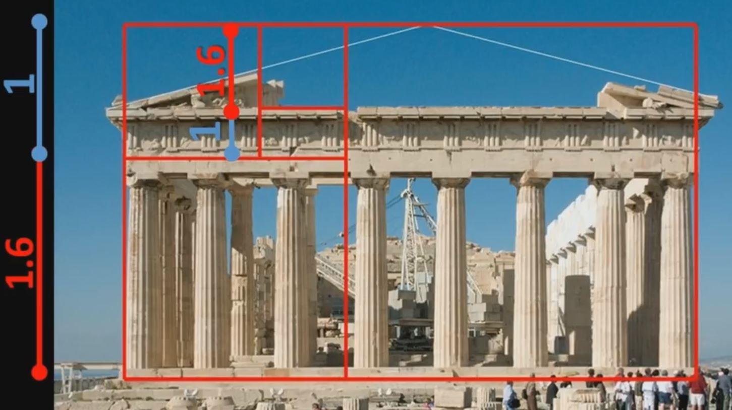
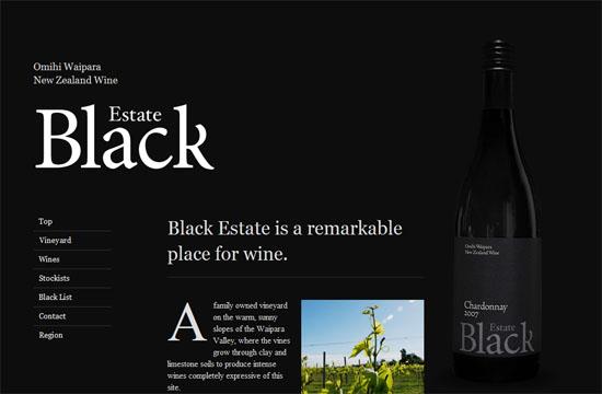
MmDesign uses the principle of the golden rectangle for the dominant image on its site.
MmDesign 在其网站的主要图像上使用金色矩形的原理。
Not only is the image striking, it has the perfect harmonic shape.
图像不仅引人注目,而且具有完美的谐波形状。
The golden rectangle is not just for site design but can be used to create balanced parts throughout a site.
黄金矩形不仅用于站点设计,还可以用于在整个站点中创建平衡零件。

The screenshot above shows how the layoutlargely comprises previous client work.
上面的屏幕截图显示了布局如何主要包括以前的客户端工作。
It also features a block of content about the agency itselfand a navigation bar in the center of the screen.
它还具有关于代理机构本身的内容块以及屏幕中心的导航栏。
The contact button, as shown also uses the golden mean as a grid system to organize the layout in a unique way.
如图所示,接触按钮还使用黄金分割作为网格系统,以独特的方式组织布局。
# Layout Design 版图设计
Master LAYOUT & COMPOSITION Design - Why Layout Is SO IMPORTANT
# Gestalt Theory 格式塔理论
This is a theory of understanding form in its unified whole.
这是一种理解理论,它是一个统一的整体。
Developed in the Berlin School of experimental psychology, it deals with the capability of human perception to generate forms out of seemingly unconnected lines and shapes.
它是由柏林实验心理学学院开发的,旨在处理人类感知能力,以看似无关的线条和形状生成形式。
It supports the idea that the whole is more than the sum of its parts.
它支持这样的想法,即整体不仅仅是其各个部分的总和。
- Closure 闭合
- Similarity 相似
- Good Continuation 良好的延续性
- Proximity 邻近
- Good Form 良好的形式
- Object and background 对象和背景
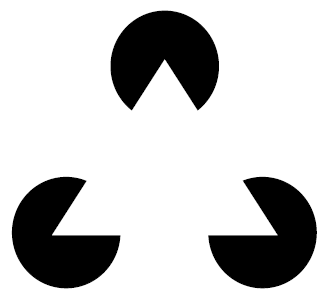
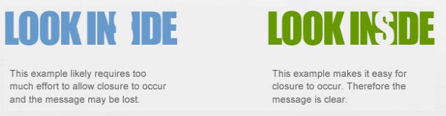
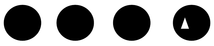
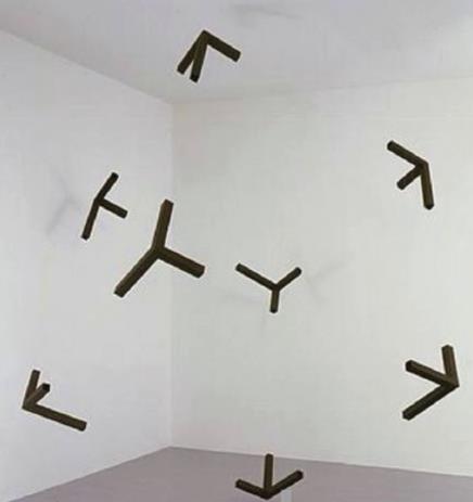
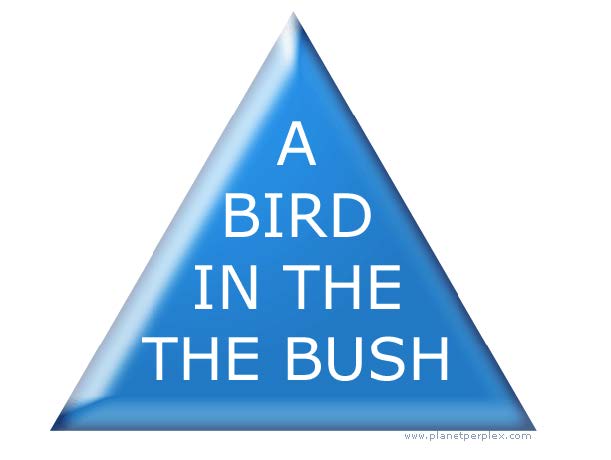
# Closure 闭合
Closure is the key for an observer to decipher shapes and forms in a picture with various lines and shapes.
闭合是观察者解密具有各种线条和形状的图片中的形状和形式的关键。
The human brain tends to fill up missing lines to build up a shape that is familiar to it.
人脑往往会填补缺失的线条,以建立自己熟悉的形状。
In the figure below the invisible lines form a triangle.
在下图中,看不见的线形成一个三角形。
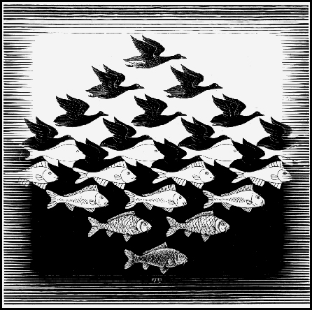
# Similarity 相似
Perception of patterns depends on characteristics of the shapes, size, color etc. in the visual field.
模式的感知取决于视野中形状,大小,颜色等的特征。
Human brain has a tendency of building patterns based on similarities.
人脑倾向于建立基于相似性的模式。
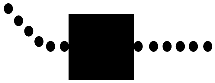
# Good Continuation 良好的延续性
This principle describes the tendency of the eye to follow a line or curve and continue in the same direction.
该原理描述了,眼睛遵循直线或曲线,并朝同一方向延伸的趋势。
It can be used effectively in guiding the eye to a desired location.
它可以有效地用于将眼睛引导到所需位置。
In the figure below the dots appear to form a line and the eye continues to follow it through the square and an imaginary line is inferred
在下图中,点似乎形成一条线,并且眼睛继续跟随它穿过正方形,并推断出一条假想线。
# Proximity 接近
When we see a collection of objects, the objects that are close together form a group in our mind.
当我们看到对象的集合时,彼此靠近的对象在我们的脑海中形成了一个群体。
Even if the objects are dissimilar – the fact that they are close to each other will evoke this sense of a group.
即使对象不同,它们彼此靠近的事实也会唤起这种群体感。
In the figure below, this principle is highlighted.
在下图中,突出显示了此原理。
# Good Form 好的形式
Humans tend to organize an image in a regular, orderly, symmetric and simple form.
人类倾向于以规则,有序,对称和简单的形式来组织图像。
The principle of Pragnanz encompasses all the gestalt principles to create a perception of the whole.
Pragnanz 原则涵盖了所有格式塔原理,从而营造出整体感。
When a complicated set of images are presented, the human mind tries to simplify them by keeping fewer elements and building an image closer to symmetry.
当呈现一组复杂的图像时,人的大脑试图通过减少元素数量,并构建更接近对称的图像来简化它们。

# Object and Background 对象和背景
The phenomenon of figure and ground was first investigated by Edgar Rubin a Danish psychologist.
图形与背景现象最先由丹麦心理学家 Edgar Rubin 研究。
It deals with the perception in a visual filed of some objects being in the foreground having dominant role and others are relegated to the background.
它处理了视觉文件中的感知,即某些对象位于前景中并具有主导作用,而其他对象则降级为背景。
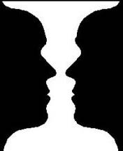
# Foreground and Background 前景和背景
Use of shapes in layouts and design bring in the aspect of foreground and background objects.
在布局和设计中使用形状会带来前景和背景对象的方面。
The foreground shapes usually convey the main subject matter while the background is used to support the foreground.
前景形状通常传达主要主题,而背景则用于支撑前景。
By careful use of shapes, various meaning can be conveyed.
通过仔细使用形状,可以传达各种含义。
# Simplicity 简单
Perfection is achieved not when there is nothing more to add but there is nothing more to take away
当没有更多可添加,但没有其他可取的东西时,就无法实现完美。Simplicity does not mean the absence of any décor.
简单并不意味着没有任何装饰。
It only means that the décor should belong intimately to the design proper and anything foreign to it should be taken away.
它仅意味着装饰应与设计本身紧密相关,并且应删除所有与设计无关的内容。Keep it simple stupid (KISS)
保持简单愚蠢(KISS)Less is more
少即是多When in doubt leave it out
如有疑问,请忽略
# Reduction 削减
Remove inessential elements
删除非必要元素
- Decide what essentially needs to be conveyed by the design;
决定设计需要传达的内容; - Critically examine every element (label, control, color, font, line weight) to decide whether it serves an essential purpose
严格检查每个元素(标签,控件,颜色,字体,线条粗细),以决定其是否满足基本目的 - Remove it if it isn't essential
如果不是必需的,请将其删除
# Double duty 双重职责
Use regular pattern
使用常规模式Limit inessential variation among elements
限制元素之间的非本质变化Use the same font, color, line width, dimensions, orientation for multiple elements
对多个元素使用相同的字体,颜色,线宽,尺寸,方向
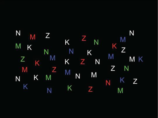
# Contrast 对比
Contrast encodes information along visual dimensions
对比度沿视觉维度编码信息
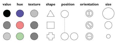
Ask yourself these questions:
问自己以下问题:
- find all the letters on the left edge of the page (position)
找到页面左侧(位置)的所有字母 - find all the red letters (hue)
查找所有红色字母(色相) - find all the K's (shape)
找到所有的 K(形状)
Which of these questions felt easy to answer, and which felt hard?
以下哪个问题容易回答,哪个很难?
The easy ones were selective visual variables.
容易的是选择性的视觉变量。
# White Space 空白空间
- Use white space for grouping instead of lines
使用空白分组而不是线条 - Use margins to draw eye around design
使用边距在设计周围吸引眼球 - Integrate figure and ground
整合图形与背景- Object should be scaled proportionally to its background
对象应与其背景成比例缩放
- Object should be scaled proportionally to its background
- Don't crowd controls together
不要挤在一起- Crowding creates spatial tension and inhibits scanning
拥挤会造成空间紧张并阻碍扫描
- Crowding creates spatial tension and inhibits scanning


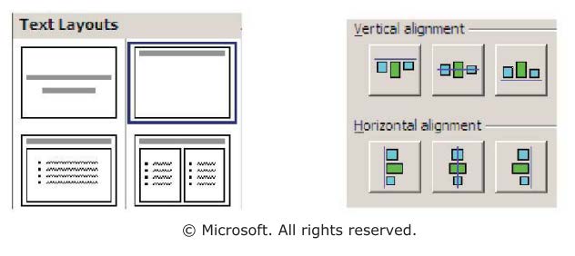
# Grids 网格
- Grids enable you to build solid structure and form into your designs
网格能够在设计中构建坚固的结构和形式 - In its most basic terms, a grid system is a structure comprising a series of horizontal and vertical lines which intersect and are then used to arrange content
从最基本的角度来说,网格系统是一种结构,包括一系列水平线和垂直线,这些线相交,然后用于布置内容 - Using a grid system in your designs is one way to achieve a level of consistency that would be otherwise extremely difficult to master and to portray in your designs
在设计中使用网格系统,是达到一致性水平的一种方法,否则将很难掌握和描述您的设计


Layout and composition tutorial: Grid variations | lynda.com
# Typography 版式
A good UI design relies heavily on the correct use of typography.
良好的 UI 设计在很大程度上取决于字体的正确使用。
Typography has its own meta-language. 印刷术有其自己的元语言。
Its shapes and relationships convey meaning even before we decode the words with which they give shape and voice.
它的形状和关系传达了意义,甚至在我们解码它们赋予形状和声音的单词之前
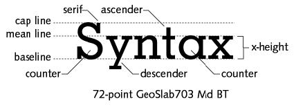
# Form and Counterform 形式与反形式
Every letter consists of the shape filled with ink, the form, and the shape defined by that shape, the counterform.
每个字母都由填充有墨水的形状,形式和由该形状定义的形状(对应形式)组成。
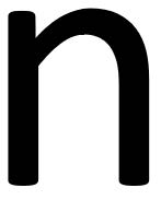
A counterform can be entirely closed, such as the interior space of the "o" partially open like the "n" or broadly open, such as the space defined by the curve and cross stroke of the "f".
配套产品可以完全封闭,例如 “o” 的内部空间。 像 “n” 一样部分打开 或宽阔的空间,例如由 “f” 的曲线和交叉笔划定义的空间
# Stems and Bowls 茎和碗
The stem of a letterform is the vertical stroke.
字母的茎是垂直笔画。
The thickness of this stroke does much to define the color density of the type, that is, how much ink the letterform will express on the paper.
此笔划的厚度在很大程度上决定了该类型的颜色密度,即该字母将在纸张上表达多少墨水。
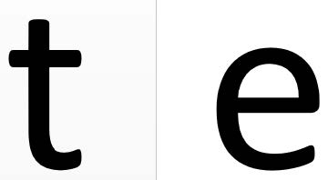
The bowls of the letterform are the rounded shapes, the geometry of the curves that make the "e" and "o" and "c" move to the same visual rhythm.
字母形的碗是圆形的,曲线的几何形状使 “e”,“o” 和 “c” 移动到相同的视觉节奏。
# Ascenders and Descenders 上升和下降
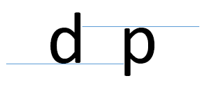
The letters grouped together to make up a word align to four horizontal marks.
组合在一起组成一个单词的字母与四个水平标记对齐。
The most obvious mark is the baseline, the bottom of letters such as "x" and "d".
最明显的标记是基线,即字母的底部,例如 “x” 和 “d”。
Lowercase letters have a second mark, the x height, that is, simply the height of the lowercase “x” in any font.
小写字母有第二个标记,x 高度,即任何字体中小写字母 “x” 的高度。
Variations in this height can make a font appear large or small in contrast to other fonts, independent of size.
高度的变化会使字体与其他字体形成对比,而与字体大小无关。
Ascenders and descenders are those parts of the letterform that rise above the x height, such as the stem of the "d" or fall below the baseline, such as the stem of the "p" respectively.
升序和降序分别是字母形状中上升到 x 高度以上的部分,例如 “d” 的茎,或下降到基线以下的那些部分,例如 “p” 的茎。
The top of the ascender defines the top of a capital letter, the cap height.
上升器的顶部定义了大写字母的顶部,即帽高。
# Readability 可读性
Many factors affect readability although the two main elements that make for good and readable composition are the correct proportions of type size to line (or “column”) width, and the horizontal flow created by the white space between the lines.
尽管影响字体质量和可读性的两个主要因素是,字体大小与线条(或 “列”)宽度的正确比例,以及线条之间的空白所产生的水平流动,但许多因素都会影响可读性。Type that is too large for the column width limits the number of words that will fit on a line, creating uneven word spacing and excess hyphenation.
对于列宽而言,太大的类型会限制一行中适合的单词数,从而导致单词间距不均和过多的连字符。Type that is too small for the column, forces the reader to move closer to the page, effectively reducing the eye span and increasing the number of saccadic movements to the end of the line. This quickly leads to fatigue.
对于列而言,该类型太小,会迫使阅读器移近页面,从而有效地减小了眼睛的跨度,并增加了行尾扫视的次数。 这很快导致疲劳。
# Typography in Design 设计中的版式
Apart from the letters themselves the spacing between letters and between lines and margin spaces make a complete statement on the use of typography in design
除了字母本身之外,字母之间以及线条和边距空间之间的间距还完整说明了排版在设计中的使用
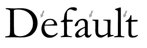
# Kerning 字距
Kerning involves adjusting the spacing between two letters in a given font. Note that this is a separate issue than tracking, which adjusts the space between all letters simultaneously
字距调整涉及调整给定字体中两个字母之间的间距。 请注意,这是与分散不同的问题,分散会同时调整所有字母之间的间距Notice how the uppercase "D" in the example below stands out significantly from the rest of the word
请注意,以下示例中的大写字母 “D” 与其他单词相比有何突出之处
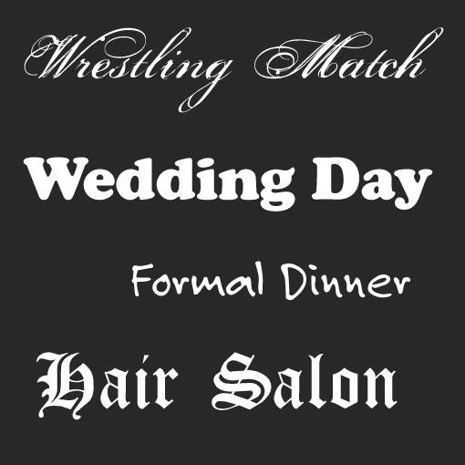
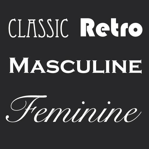
# Fonts 字体
There is an inherent psychology associated with certain types of fonts
与某些类型的字体有关的内在心理Compare the fonts on left with those on the right
比较左边的字体和右边的字体
# Alignment 对齐方式
Creative use of typography provides the right focus on this site design.
字体创造性使用可以正确地关注此网站设计。
Improving Web and Mobile App Typography - 5 basic guidelines
# Font to help Memory 字体以帮助记忆
A team of researchers at Australia's Royal Melbourne Institute of Technology has come up with a new type font called Sans Forgetica.
澳大利亚皇家墨尔本理工学院的一组研究人员提出了一种新字体,称为 Sans Forgetica。
Its purpose is to help readers remember what has been written using it.
其目的是帮助读者记住使用它编写的内容。The idea behind the new font was to create a slightly more difficult reading experience, forcing the reader to absorb each word as they stare at it.
新字体背后的想法是创造稍微困难的阅读体验,迫使读者在凝视每个单词时吸收它们。
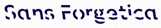
A font that helps you remember what you read—Sans Forgetica
Sans Forgetica | The font to remember | RMIT University
# Color
- We see the world via a reflective color model
我们通过反射色模型看到世界- Light strikes a surface and is reflected to our eyes -- Properties of surface dictate color
光线撞击表面并反射到我们的眼睛 -- 表面的性质决定了颜色 - Subtractive color model -- Cyan Magenta, Yellow primaries
减色模型 -- 青色、洋红色,黄色原色
- Light strikes a surface and is reflected to our eyes -- Properties of surface dictate color
- Colors on display follow the emitted model
显示器的颜色遵循发射模型- Additive color model -- Red Green Blue primaries
加色模型 -- 红色、绿色、蓝色原色
- Additive color model -- Red Green Blue primaries
# HSV Model
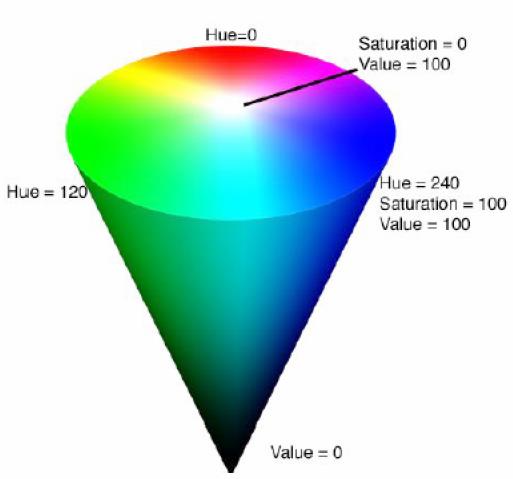
Hue
色相- Basic Color, Pigment
基本颜色,颜料 - Wavelength (red, green, yellow, blue)
波长(红色,绿色,黄色,蓝色) - Spectrum (VIBGYOR)
频谱![]()
- Basic Color, Pigment
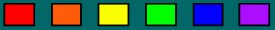
Saturation
饱和度- Relative purity, Brightness or intensity of a color
相对纯度,颜色的亮度或强度 - Pastel versus strong (baby blue, sky blue, royal blue)
柔 vs 强(浅蓝色,天蓝色,宝蓝色)![]()
- Relative purity, Brightness or intensity of a color
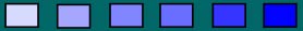
Value
价值- Lightness or darkness of a color
颜色的明暗 - Amount of energy (white, light gray, dark gray, black)
能量(白色,浅灰色,深灰色,黑色) - Usually V = 0.299*R + 0.587*G + 0.114*B
![]()
- Lightness or darkness of a color
Most commonly used model
最常用的模型
# Guidelines
- Display color images on black background
在黑色背景上显示彩色图像 - Choose bright foreground color (white, bold green …)
选择明亮的前景色(白色,绿色的粗体...) - Avoid brown and green as background color
避免使用棕色和绿色作为背景色 - Be sure foreground colors contrast in both brightness and hue with background colors
确保前景色与背景色在亮度和色调上形成对比 - Use color sparingly – design b/w and then add color
少用颜色–设计黑白,然后添加颜色 - Use color to draw attention, communicate organization and to establish relationships
用颜色吸引注意力,沟通组织并建立关系 - Avoid using color in non-task related ways
避免以与任务无关的方式使用颜色
# Associations
Red | Hot, warning, aggression, love |
Pink | Female, Cute, Cotton, Candy |
Orange | Autumn, Warm, Halloween |
Yellow | Happy, Caution, Joy |
Brown | Warm, Fall, Dirt, Earth |
Green | Lush, Pastoral, Envy |
Purple | Royal, Sophisticated, Barney |
# Cultural Colors
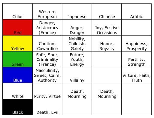
The Effect of Color | Off Book | PBS Digital Studios
# Minimalist Design 极简设计
- "Less is More"
“少即是多” - Identify what is really needed
确定真正需要的 - If complex to explain/document, then redesign
如果要解释 / 记录很复杂,请重新设计 - Concise language
简洁的语言 - Avoid extraneous pictures and information
避免多余的图片和信息- Fewer options and menu choices
更少的选项和菜单选择 - Reduces planning time
减少计划时间 - Extra options can confuse users
额外的选项可能会使用户感到困惑 - Reduces manual size, etc.
缩小手动尺寸等 - E.g. in XXX product: "Show Actuator"
例如 在 XXX 产品中:“显示执行器”
- Fewer options and menu choices

Minimalism is a way of thinking, a process, which strips the subject down to its bare bones.
极简主义是一种思维方式,是一个过程,可以将主体分解为裸露的骨头。
Removing all these superfluous elements leaves the 'core' essentials, free from distraction.
删除所有这些多余的元素将使 “核心” 要素免于分心。
It's more than a trend or fashion, it's is one of the most significant design movements of the 20th and early 21st century.
它不只是一种趋势或时尚,它还是 20 世纪和 21 世纪初最重要的设计运动之一。
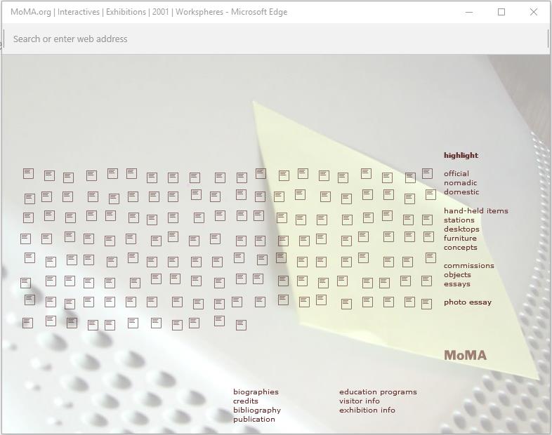
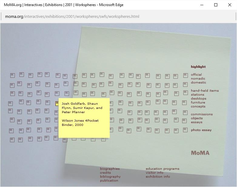
The MOMA home screen is designed with the beautiful ideas of minimalism.
MOMA 主屏幕采用极简主义的精美设计。
The subtle colors and minimal titles – give it an aura of sophistication and class.
细腻的色彩和极少的标题–赋予其精致和一流的氛围。
However, the use of icons to browse various data items is impossible to remember and results in extensive searching.
但是,使用图标浏览各种数据项是不可能记住的,并且会导致大量搜索。
- Use color 使用颜色
- don't just go for black and white because of a self-imposed (and unnecessary) restriction.
不仅限于黑白,因为存在自我限制(并且是不必要的)。
Use as much color as the design requires – 'too much' color could be used as a process of juxtaposition.
根据设计需要,使用尽可能多的颜色 - “过多” 的颜色可以并置使用。
You also shouldn't focus on leaving white space for the sake of it, since 'open' space is more critical to communicate effectively.
同样,也不应该为此而留白空间,因为 “开放” 空间对于有效沟通至关重要。 - Think about the user 考虑用户
- To paraphrase Steve Jobs, "design is how it works, not just what it looks and feels like".
用史蒂夫・乔布斯的话解释:“设计是它的工作方式,而不仅仅是它的外观和感觉”。
When used correctly, minimalist techniques emphasize functionality and typography equally.
如果使用得当,极简主义技术会同时强调功能和排版。
Having a miniscule amount of information on a near empty page will just scare people away.
在接近空白的页面上只有很少量的信息,只会吓跑用户。 - Embrace clarity, not chaos 拥抱清晰,不要混乱
- Don't make the mistake of thinking a minimalist design adds mystery to your brand or website, you'll just end up confusing people.
不要误以为极简设计会给您的品牌或网站增添神秘感,最终只会使人们感到困惑。
If people want mystery, they'll watch Sherlock; when they use a website, read a magazine or open an app, they want clarity, accessibility and intuitive functions.
如果想要神秘,人们会看 Sherlock 的。 当他们使用网站,阅读杂志或打开应用程序时,他们想要清晰的、可访问的和直观的功能。
Brand Free: How Minimalist Design Connects People