# Objectives 目标
- Know how to standardize the numeric variables
知道如何标准化数值变量 - Know how to choose the optimal visualization tool
to analyze the covariation of two variables
知道如何选择最佳的可视化工具来分析两个变量的协变
# Reading Materials 阅读材料
Chapter 7, R for Data Science by Garrett Grolemund and Hadley Wickham, available freely online. https://r4ds.had.co.nz/exploratory-data-analysis.html
Chapter 3 & 4, Data Science Using Python and R, Print ISBN:9781119526810 , Online ISBN:9781119526865. https://onlinelibrary.wiley.com/doi/book/10.1002/9781119526865
# Data Preparation 数据准备
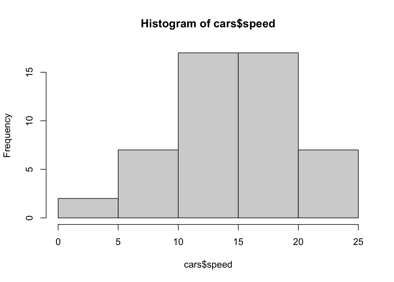
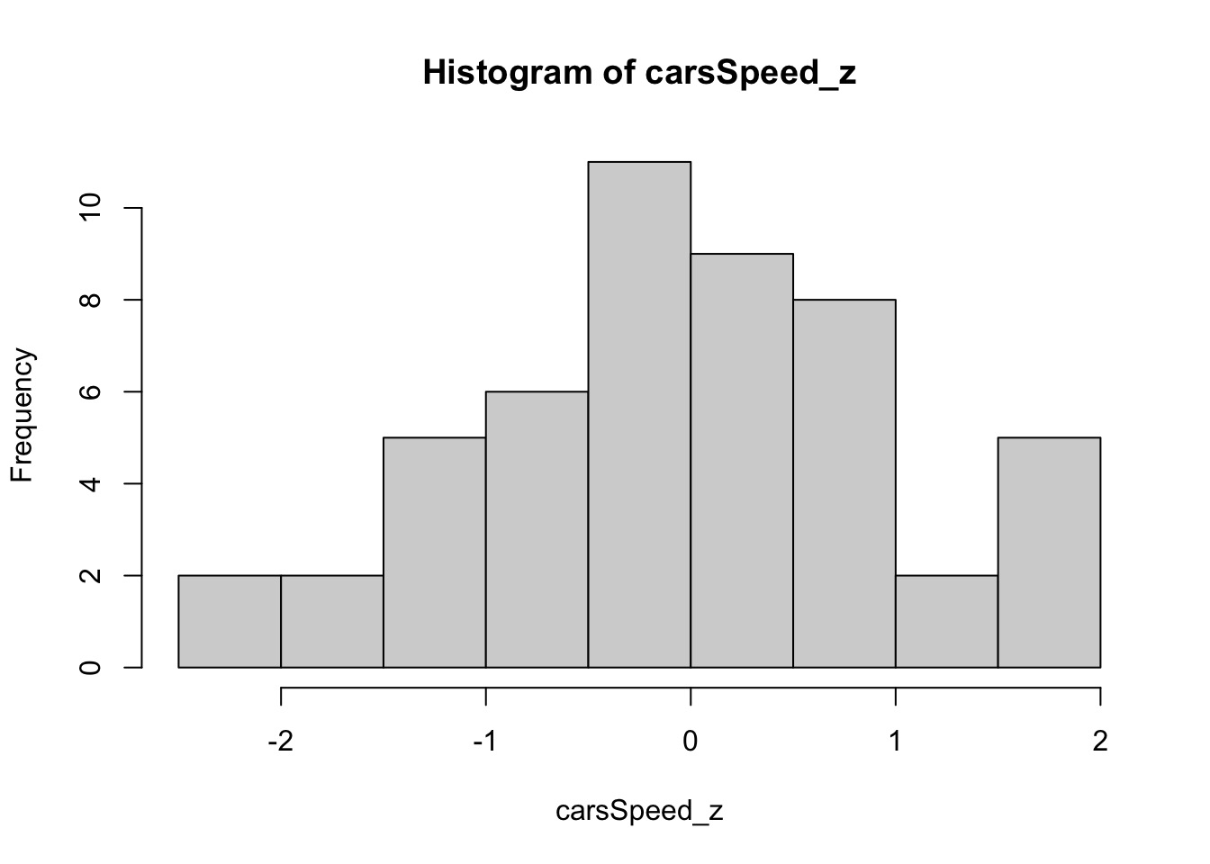
# scale Standardizing the Numeric Fields 标准化数字字段
Certain algorithms perform better when the numeric fields are standardized so the filed mean equals 0 and the field standard deviation equals 1, as follows:
数字字段被标准化后,字段平均值等于 0,字段标准差等于 1,使得某些算法的性能会更好,如下所示:
hist(cars$speed) #histogram of car$speed |
carsSpeed_z <- scale(cars$speed) #standardizing car$speed | |
hist(carsSpeed_z) |
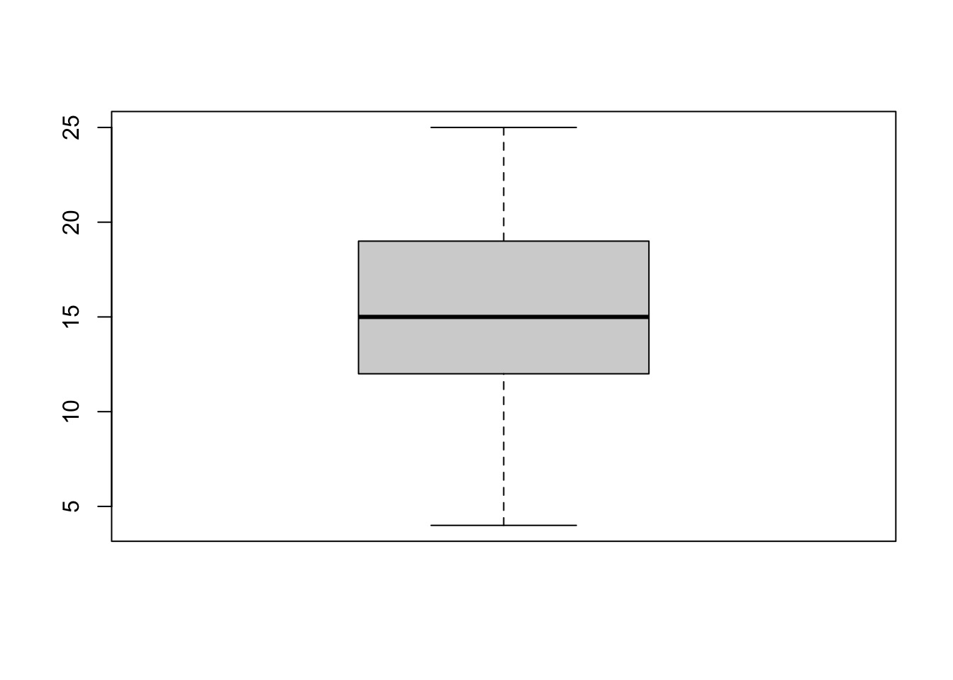
# Identifying Outliers 识别异常值
A rough rule of thumb is that a data value is an outlier if its value is either greater than 3, or less than -3. Why?
一个大体规则是,如果 z 的值大于 3 或者小于 -3,那么这个数据值是一个异常值,为什么?
1 - pnorm(3) # The probability P(Z > 3) |
[1] 0.001349898
pnorm(-3) # The probability P(Z<= -3) |
[1] 0.001349898
carsSpeed_outliers <- cars[carsSpeed_z < -3 | carsSpeed_z > 3, ] | |
carsSpeed_outliers |
[1] speed dist
<0 rows> (or 0-length row.names)
boxplot(cars$speed) #using boxplot to distinguish outliers |
# In-class Exercise 课堂练习
Standardize the field car$dist . Produce a listing of all the car items that are outliers at the high end of the scale.
规范 car$dist 。列出所有属于高端异常值的汽车项目。
carsDist_z <- scale(cars$dist) | |
carsDist_outliers <- cars[carsDist_z > 3, ] | |
carsDist_outliers | |
boxplot(carsDist_z) | |
max(carsDist_z) | |
carsDist_outliers <- cars[carsDist_z > 2.9, ] | |
carsDist_outliers | |
boxplot(carsDist_z) |
# Exploratory Data Analysis EDA 探索性数据分析
A task that how to use visualization and transformation to explore your data in a systematic way is called exploratory data analysis, or EDA for short.
使用可视化和转换,以系统的方式探索数据,称为探索性数据分析,或简称 EDA。
Use graphics to explore the relationship between the predictor variables and the target variable.
使用图形探索预测变量和目标变量之间的关系。Use graphics and tables to derive new variables that will increase predictive value
使用图形和表格推导出将增加预测值的新变量
Let's import the library first.
先导入库。
library(tidyverse) |
─ Attaching packages ──────── tidyverse 1.3.1 ─
✓ ggplot2 3.3.5     ✓ purrr   0.3.4
✓ tibble  3.1.4     ✓ dplyr   1.0.7
✓ tidyr   1.1.3     ✓ stringr 1.4.0
✓ readr   2.0.1     ✓ forcats 0.5.1
─ Conflicts ────────── tidyverse_conflicts() ─
x dplyr::filter() masks stats::filter()
x dplyr::lag()    masks stats::lag()
More information about tibble at https://r4ds.had.co.nz/tibbles.html#tibbles.
Details about data import at https://r4ds.had.co.nz/data-import.html.
library(hexbin) |
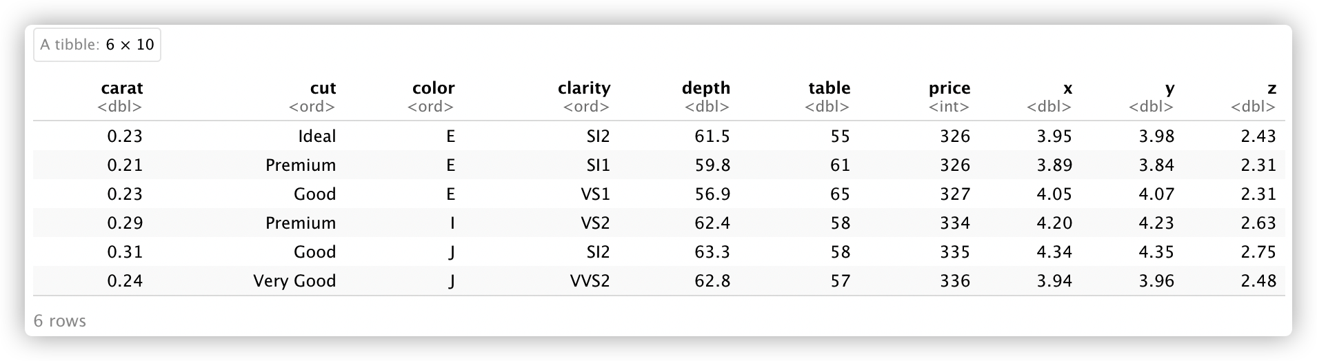
Today we will play with a built-in data set diamonds in the package ggplot2 .
head(diamonds) |
A tibble:6 × 10
summary(diamonds) |
     carat               cut        color        clarity
 Min.   :0.2000   Fair     : 1610   D: 6775   SI1    :13065
 1st Qu.:0.4000   Good     : 4906   E: 9797   VS2    :12258
 Median :0.7000   Very Good:12082   F: 9542   SI2    : 9194
 Mean   :0.7979   Premium  :13791   G:11292   VS1    : 8171
 3rd Qu.:1.0400   Ideal    :21551   H: 8304   VVS2   : 5066
 Max.   :5.0100                     I: 5422   VVS1   : 3655
                                    J: 2808   (Other): 2531
     depth           table           price             x
 Min.   :43.00   Min.   :43.00   Min.   :  326   Min.   : 0.000
 1st Qu.:61.00   1st Qu.:56.00   1st Qu.:  950   1st Qu.: 4.710
 Median :61.80   Median :57.00   Median : 2401   Median : 5.700
 Mean   :61.75   Mean   :57.46   Mean   : 3933   Mean   : 5.731
 3rd Qu.:62.50   3rd Qu.:59.00   3rd Qu.: 5324   3rd Qu.: 6.540
 Max.   :79.00   Max.   :95.00   Max.   :18823   Max.   :10.740

       y                z
 Min.   : 0.000   Min.   : 0.000
 1st Qu.: 4.720   1st Qu.: 2.910
 Median : 5.710   Median : 3.530
 Mean   : 5.735   Mean   : 3.539
 3rd Qu.: 6.540   3rd Qu.: 4.040
 Max.   :58.900   Max.   :31.800
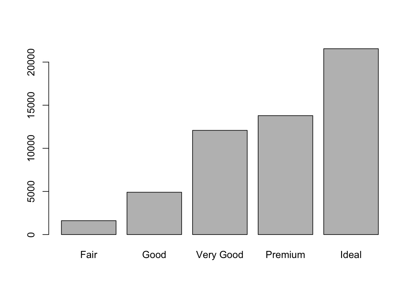
# Barplot Revisit 重温条形图
From the above information, we know cut is a categorical field.
从上面的信息,我们知道 cut 是一个分类字段。
We can use barplot to visualize the distribution of the categorical/discrete variable.
我们可以用 barplot 来对分类 / 离散变量的分布进行可视化。
# regular way | |
barplot(table(diamonds$cut)) |
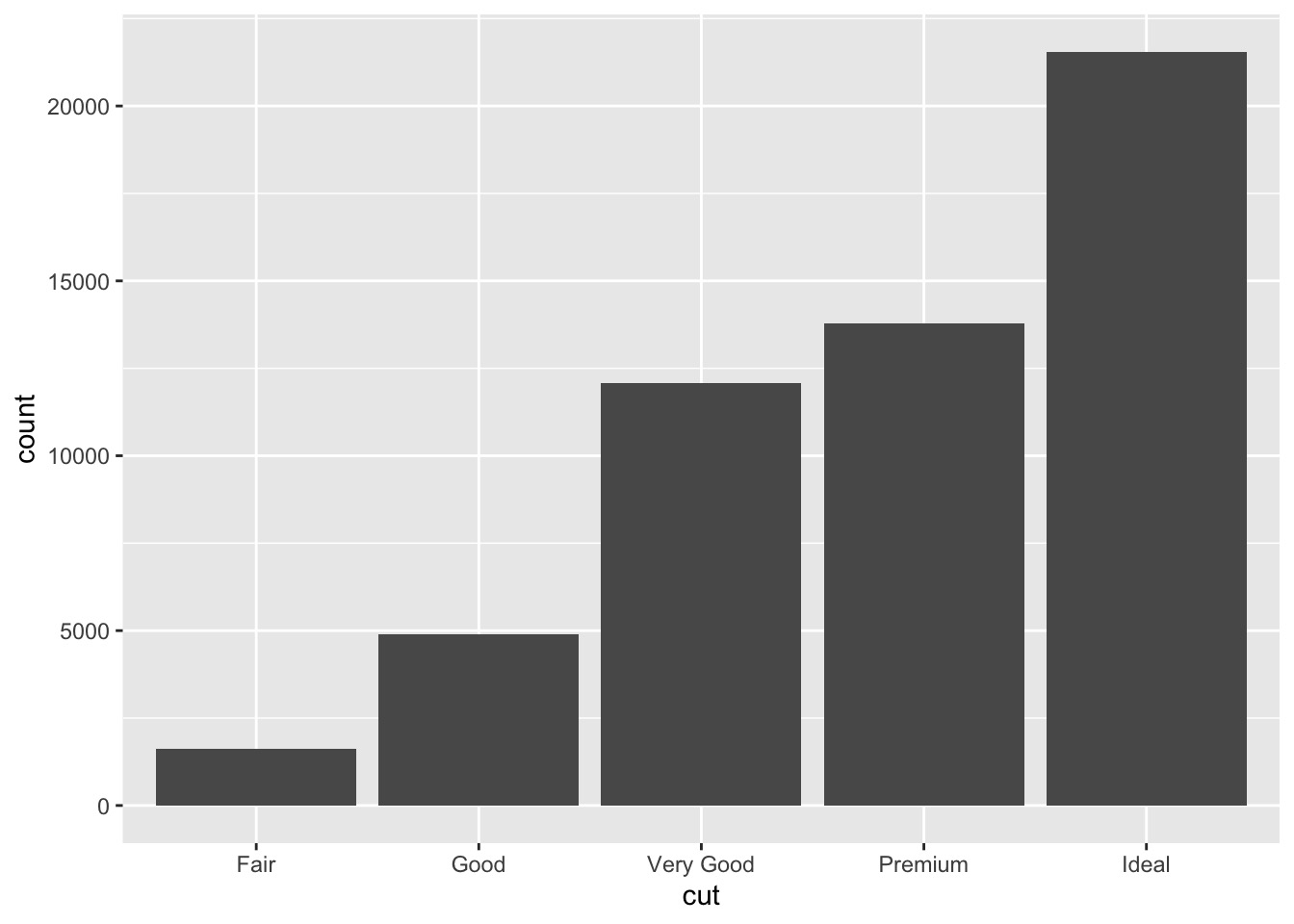
# we can also use ggplot | |
ggplot(data = diamonds) + | |
geom_bar(mapping = aes(x = cut)) |
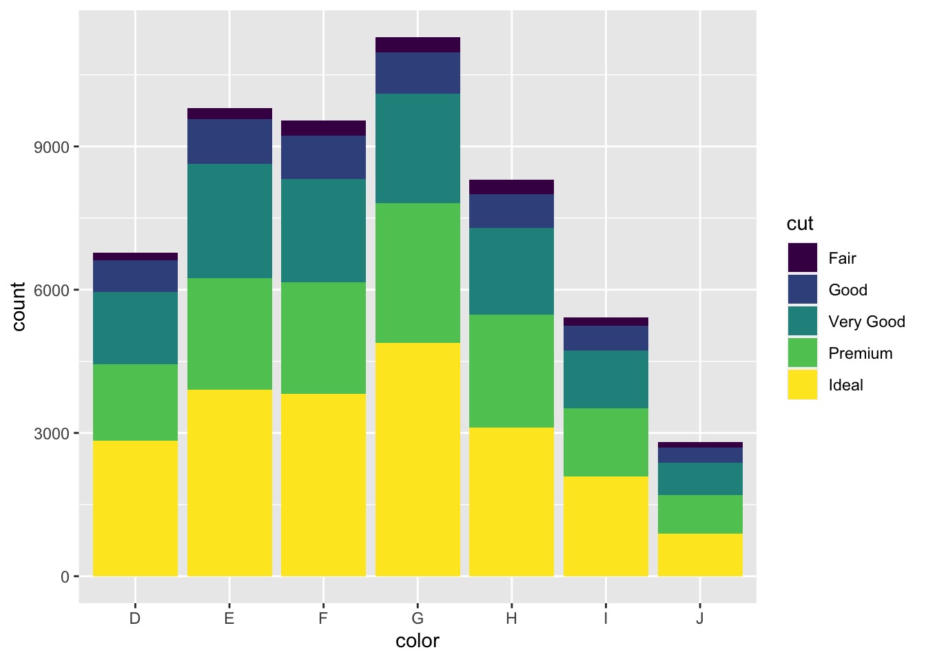
# geom_bar() to construct a Barplot with Overlay
使用 geom_bar() 叠加构建条形图
ggplot(data = diamonds, aes(x = color)) + | |
geom_bar(aes(fill = cut)) |
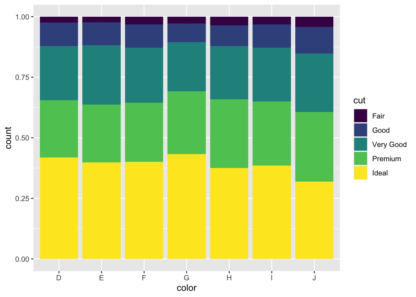
ggplot(data = diamonds, aes(x = color)) + | |
geom_bar(aes(fill = cut), position = "fill") #normalized the barplot |
ggplot(data = diamonds, aes(x = cut)) + | |
geom_bar(aes(fill = color), position = "fill") + | |
coord_flip() #normalized the barplot and make it horizontal |
# In-class Exercise: geom_bar()
Please use
barplotandgeom_bar()to investigateclarityattribute indiamondsdata set.
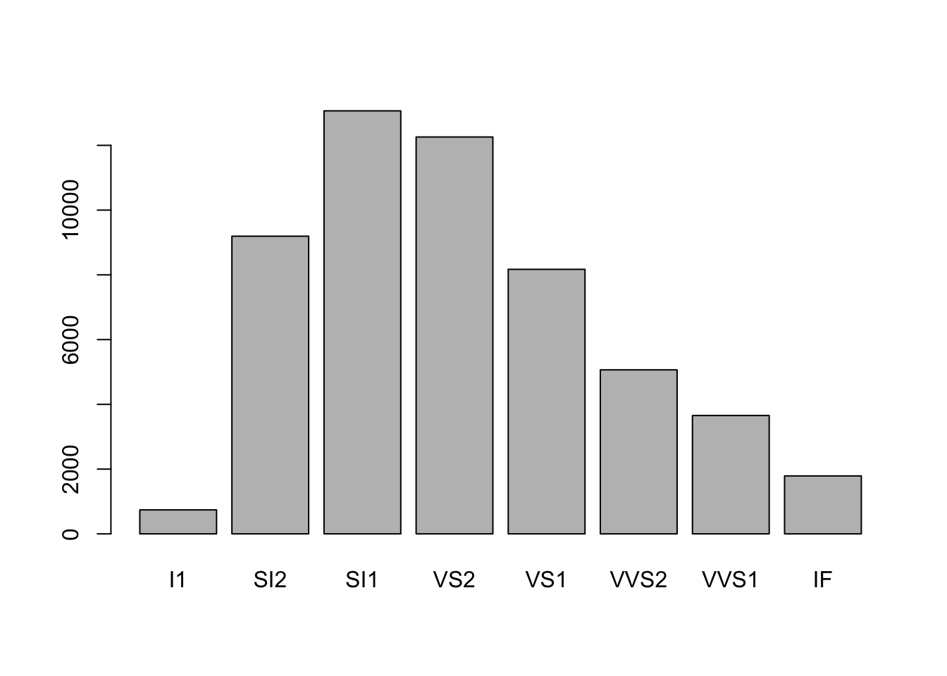
请使用barplot和geom_bar()调查数据集diamonds中的clarity属性。barplot(table(diamonds$clarity)) #regular way
![]()
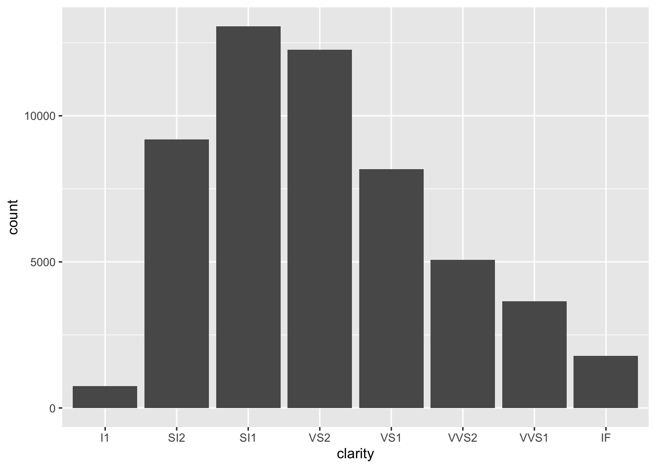
ggplot(data = diamonds) +
geom_bar(mapping = aes(x = clarity)) #we can also use ggplot
![image.png]()
Please use
geom_bar()to investigate the relationship betweenclarityandcut.
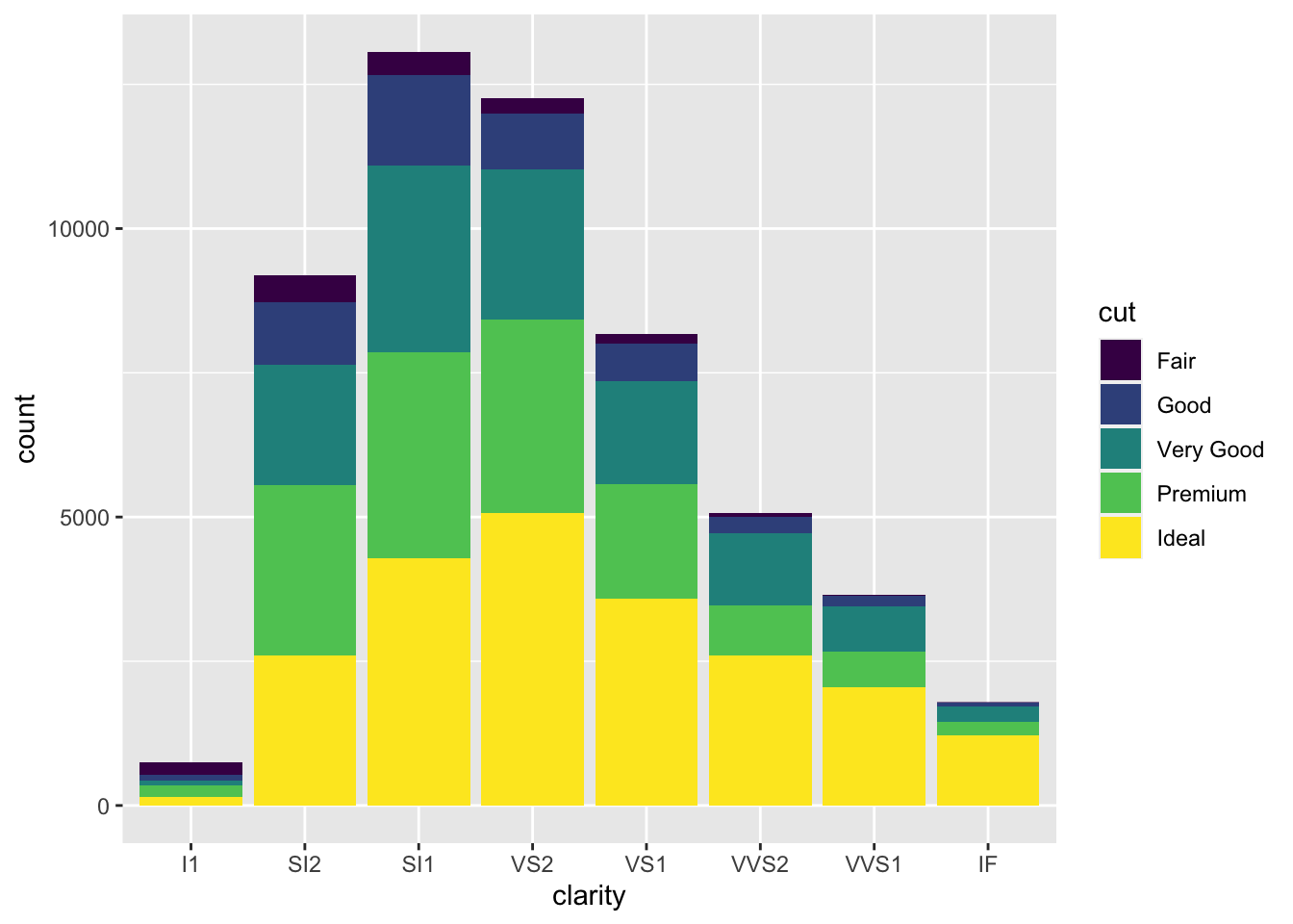
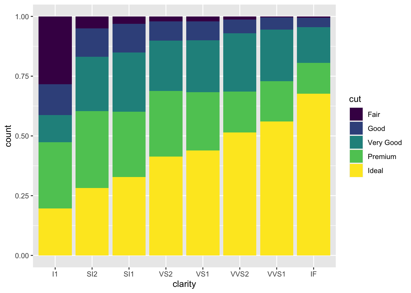
请使用geom_bar()调查clarity和cut之间的关系。ggplot(data = diamonds, aes(x = clarity)) +
geom_bar(aes(fill = cut))
![]()
ggplot(data = diamonds, aes(x = clarity)) +
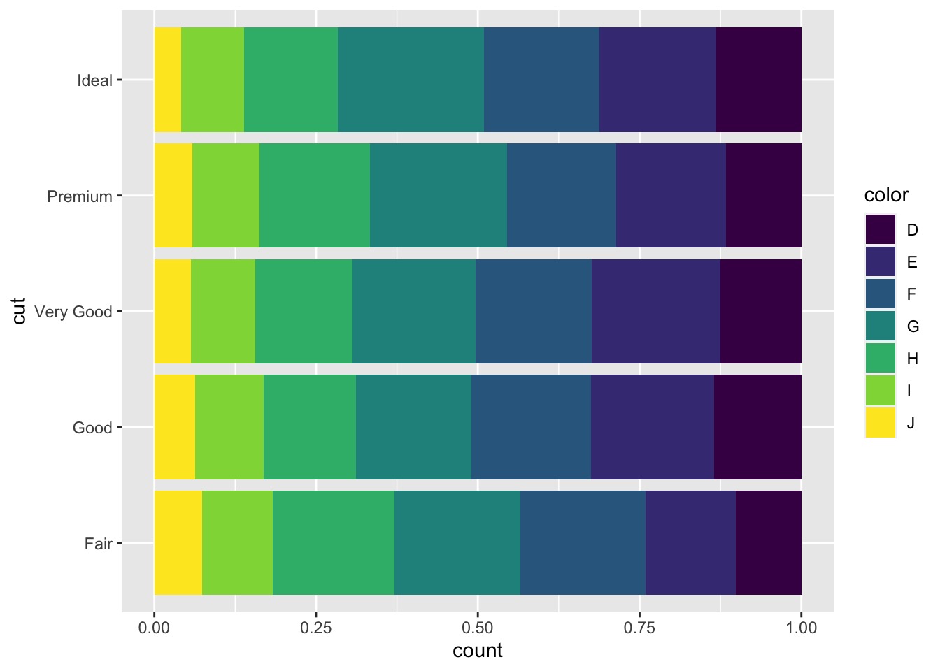
geom_bar(aes(fill = cut), position = "fill") #normalized the barplot
![]()
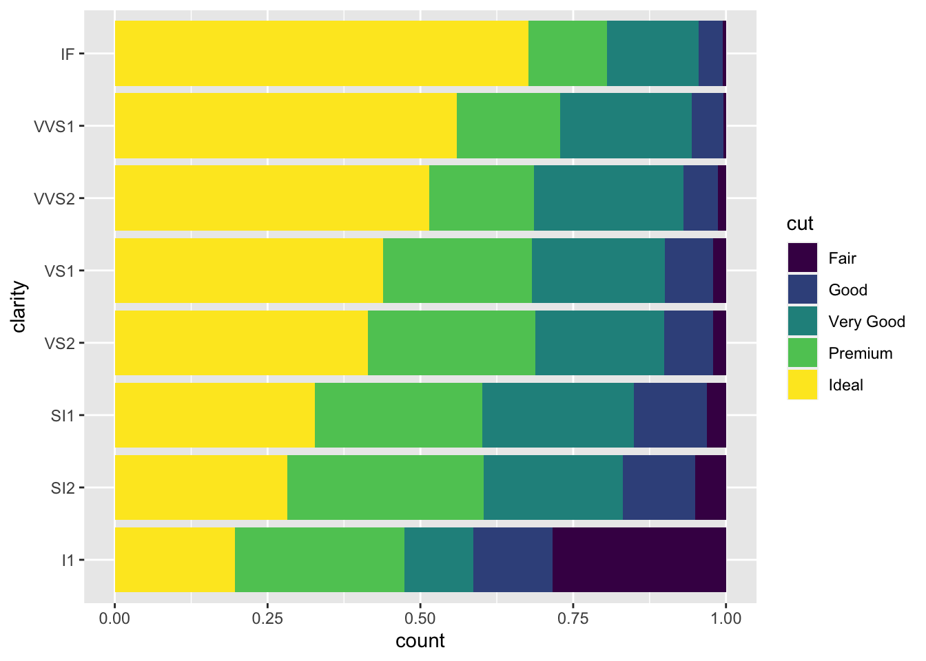
ggplot(data = diamonds, aes(x = clarity)) +
geom_bar(aes(fill = cut), position = "fill") +
coord_flip() #normalized the barplot and make it horizontal
![]()
# geom_count() to visualize the covariation between categorical variables
使用 geom_count() 对分类变量之间的协变进行可视化
ggplot(data = diamonds) + | |
geom_count(mapping = aes(x = cut, y = color)) |
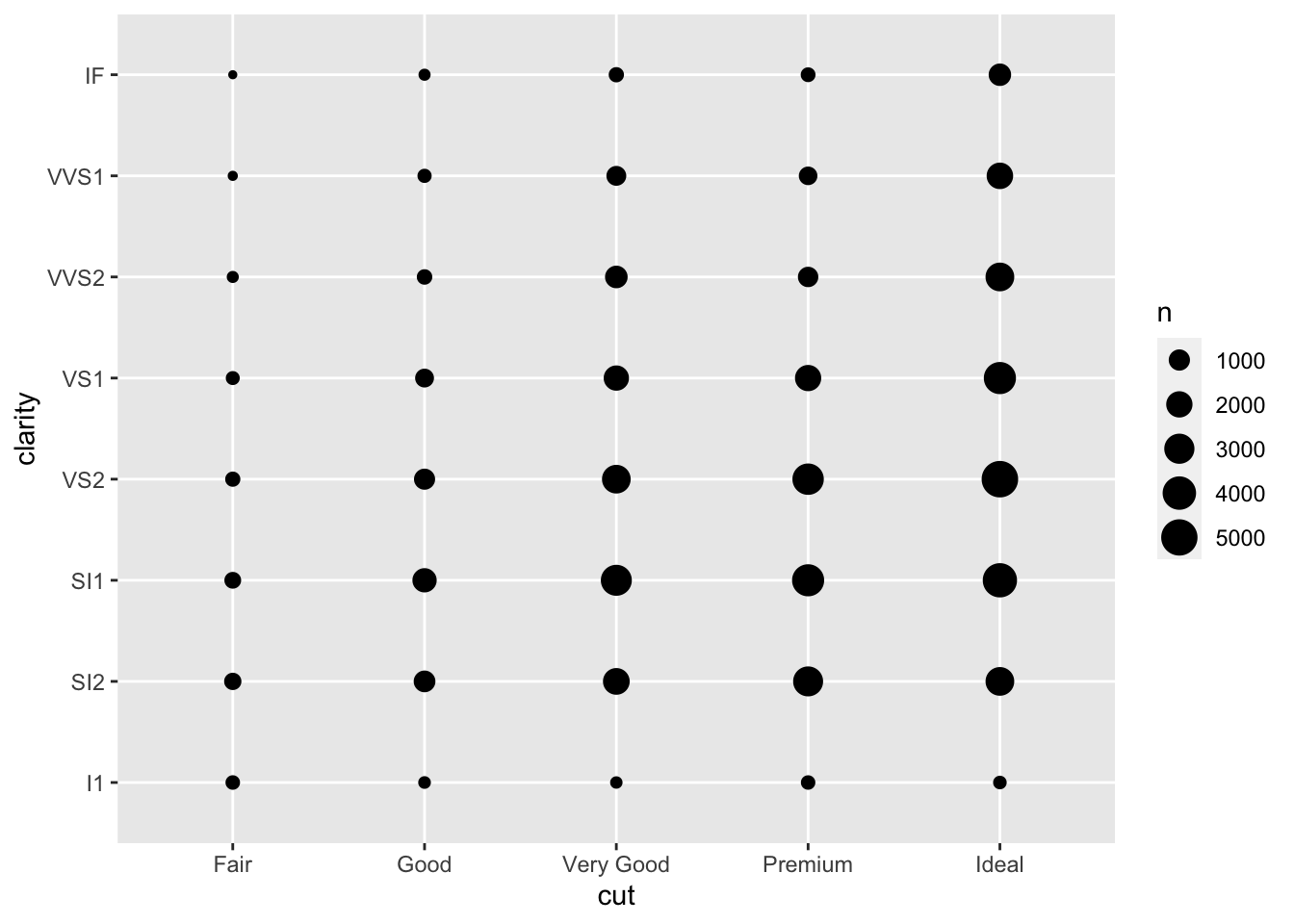
The size of each circle in the plot displays how many observations occurred at each combination of values. Covariation will appear as a strong correlation between specific x values and specific y values.
图中每个圆圈的大小显示在每个值组合中出现的观察次数。协变将表现为特定 x 值和特定 y 值之间的强相关性。
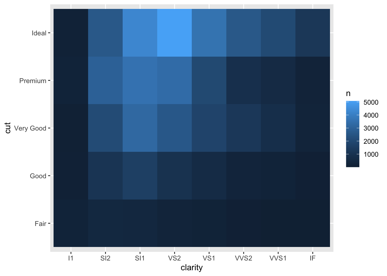
Another approach is to compute the count with dplyr :
另一种方法是使用 dplyr 以下方法计算计数:
diamonds %>% | |
count(color, cut) %>% | |
ggplot(mapping = aes(x = color, y = cut)) + | |
geom_tile(mapping = aes(fill = n)) |
# In-class Exercise: Investigate Two Categorical Variables 研究两个分类变量
Please use
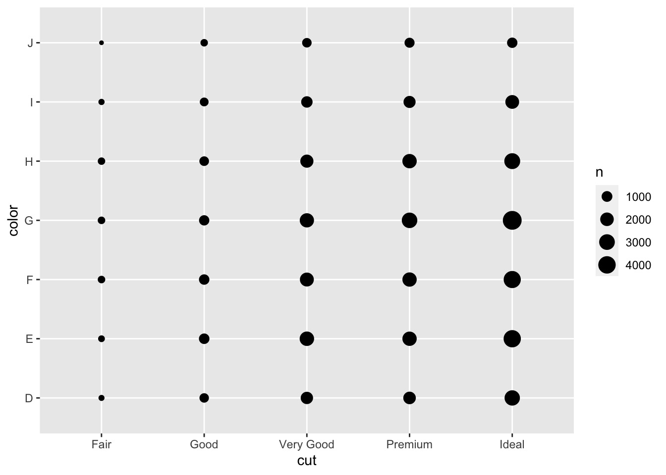
geom_count()to investigate the relationship betweenclarityandcut.
请使用geom_count()调查clarity和cut之间的关系。ggplot(data = diamonds) +
geom_count(mapping = aes(x = cut, y = clarity))
![]()
Please use
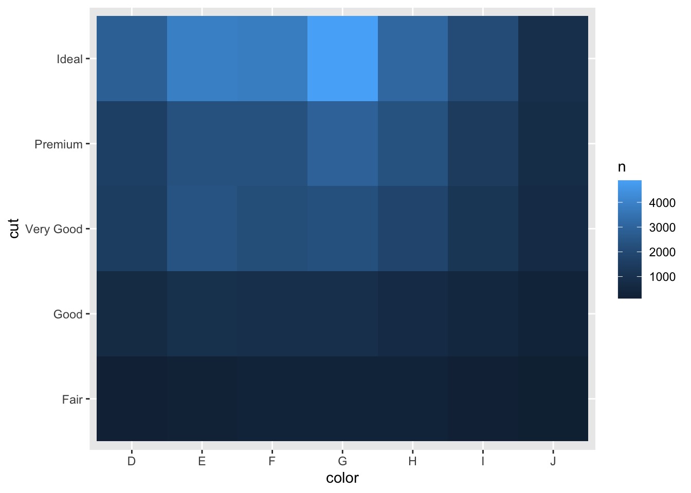
geom_tile()to investigate the relationship betweenclarityandcut.
请使用geom_tile()调查clarity和cut之间的关系。diamonds %>%count(clarity, cut) %>%
ggplot(mapping = aes(x = clarity, y = cut)) +
geom_tile(mapping = aes(fill = n))
![]()
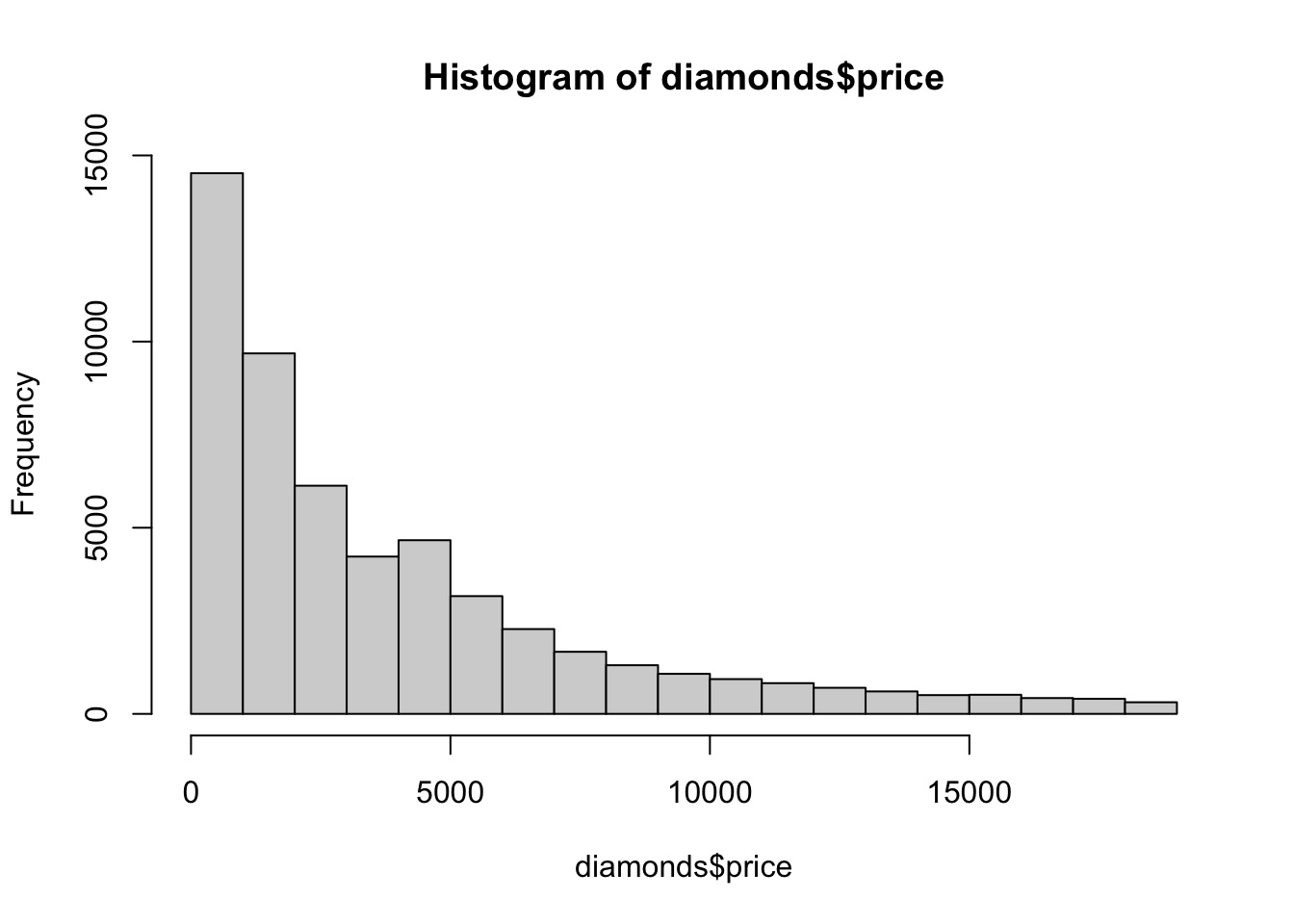
# Histogram Revisit 重温直方图
From the above information, we know price is a continuous variable.
由以上信息,我们知道 price 是一个连续变量。
We can use hist to visualize the distribution of the continuous variable.
我们可以用 hist 来对连续变量的分布进行可视化。
# regular way | |
hist(diamonds$price) |
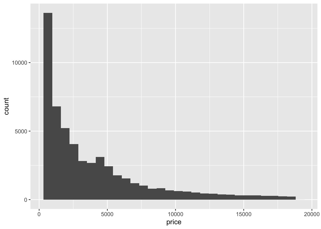
# we can also use ggplot | |
ggplot(data = diamonds) + | |
geom_histogram(mapping = aes(x = price),bins = 30) |
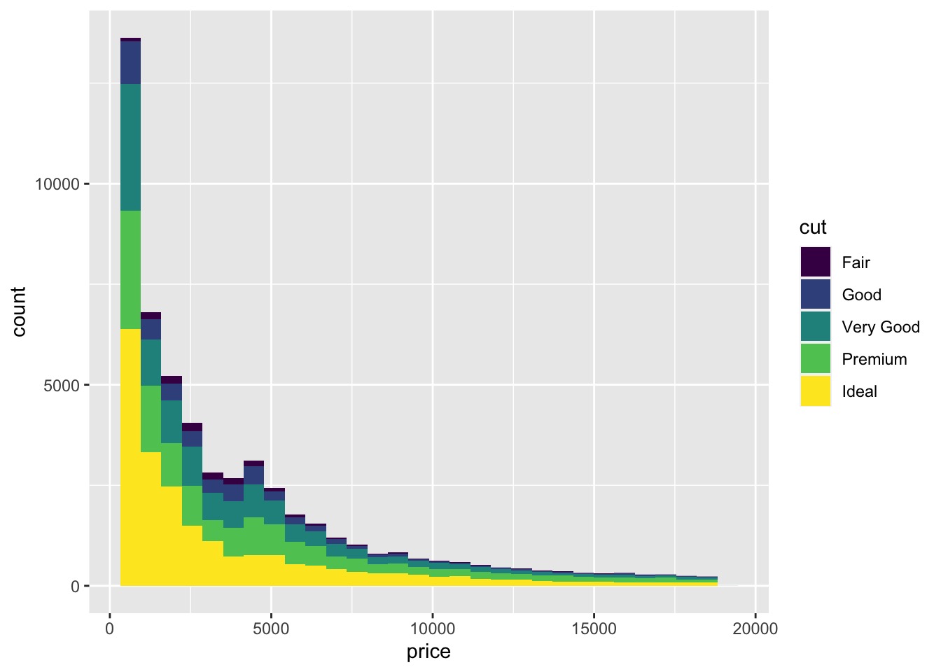
# geom_histogram() to construct a Histogram with Overlay
使用 geom_histogram() 叠加构建直方图
ggplot(data = diamonds, aes(x = price)) + | |
geom_histogram(aes(fill = cut),bins = 30) |
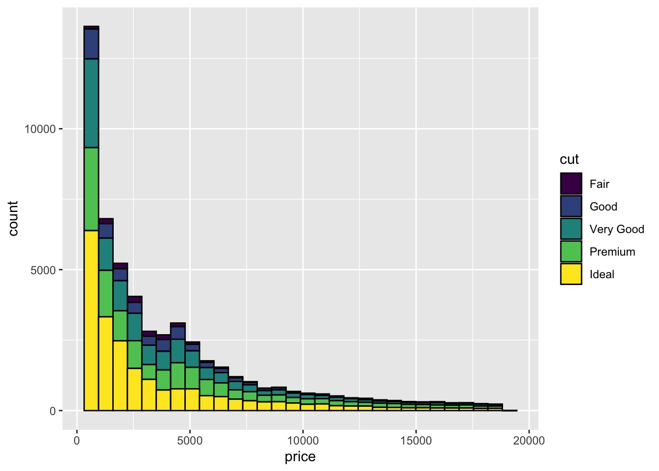
# have black lines around each bar | |
ggplot(data = diamonds, aes(x = price)) + | |
geom_histogram(aes(fill = cut), bins = 30, color = "black") |
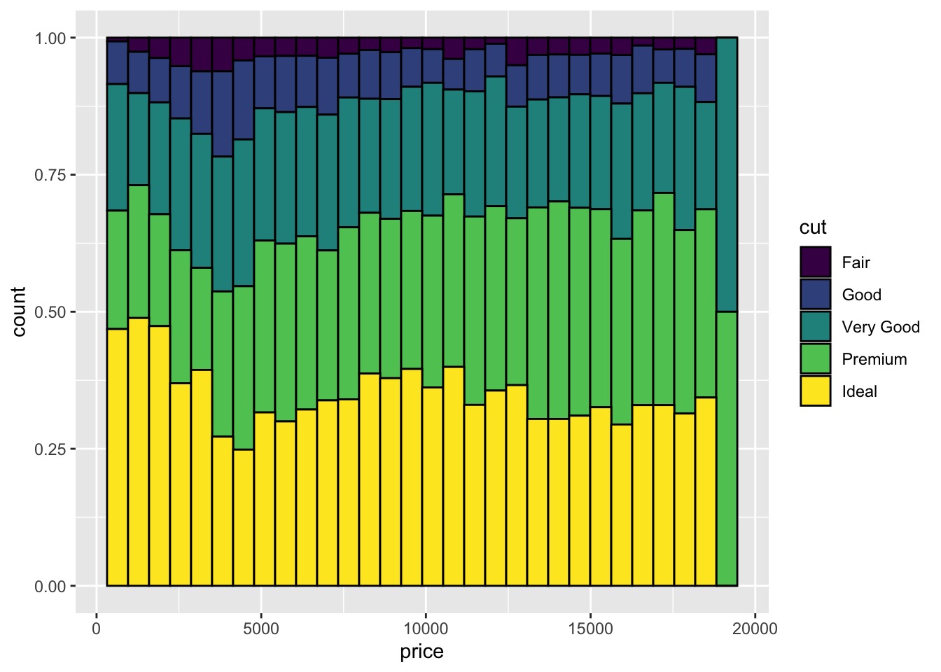
# normalize the histogram | |
ggplot(data = diamonds, aes(x = price)) + | |
geom_histogram(aes(fill = cut), bins = 30, color = "black", position = "fill") |
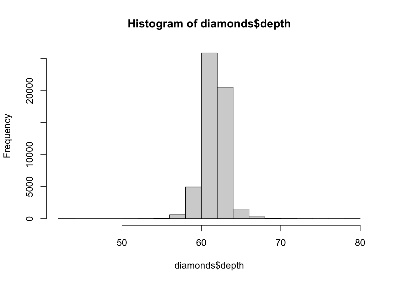
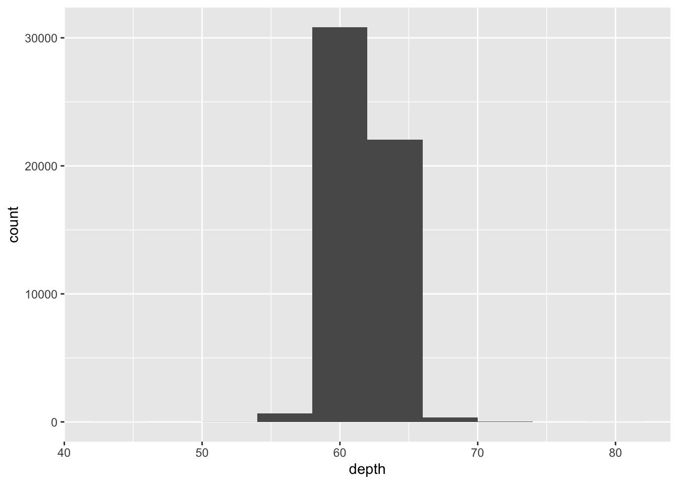
# In-class Exercise: geom_histogram()
Please use
histandgeom_histogram()to investigatedepthattribute indiamondsdata set.
请使用hist和geom_histogram()调查数据集diamonds中的depth属性。hist(diamonds$depth)
![]()
ggplot(data = diamonds) +
geom_histogram(mapping = aes(x = depth), bins = 10)
![]()
summary(diamonds$depth)
depth1Q3Q <- diamonds$depth[diamonds$depth >= 61 & diamonds$depth <= 62.5]
length(depth1Q3Q)
ggplot(data = diamonds) +
geom_histogram(mapping = aes(x = depth1Q3Q), bins = 10)
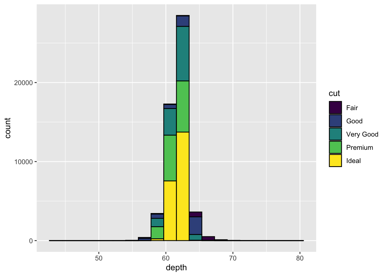
Please use
geom_histogram()to investigate the relationship betweendepthandcut.
请使用geom_histogram()调查depth和cut之间的关系。ggplot(data = diamonds, aes(x = depth)) +
geom_histogram(aes(fill = cut), bins = 20, color="black")
![]()
# geom_freqpoly() to show the covariation of two variables
使用 geom_freqpoly() 显示两个变量的协变。
ggplot(data = diamonds, mapping = aes(x = price)) + | |
geom_freqpoly(mapping = aes(colour = cut), bins = 30) |
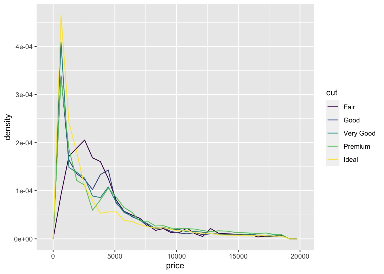
The default appearance of geom_freqpoly() is not that useful for that sort of comparison because the height is given by the count.geom_freqpoly() 的默认外观对于这种比较没有多大用处,因为高度是由计数给出的。
That means if one of the groups is much smaller than the others, it’s hard to see the differences in shape.
这意味着如果其中一组比其他组小得多,很难看出形状的差异。
For example, let’s explore how the price of a diamond varies with its quality:
例如,让我们探索钻石的价格如何随其质量变化:
# density is displayed on the y-axis | |
ggplot(data = diamonds, mapping = aes(x = price, y = ..density..)) + | |
geom_freqpoly(mapping = aes(colour = cut), bins = 30) |
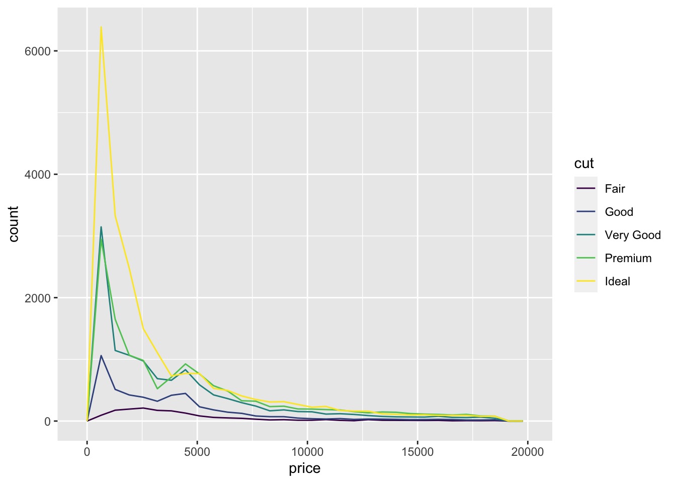
# In-class Exercise: Investigate A Categorical and Continuous Variable 研究分类和连续变量
Please use
geom_freqpoly()to investigate the relationship betweendepthandcut.ggplot(data = diamonds, mapping = aes(x = depth)) +
geom_freqpoly(mapping = aes(colour = cut), bins = 30)
# Boxplot Revisit 重温箱线图
Another alternative to display the distribution of a continuous variable broken down by a categorical variable is the boxplot.
显示分类变量分解得到的连续变量的分布的另一种替代方法是箱线图。
# geom_boxplot() to investigate A Categorical and Continuous Variable
使用 geom_boxplot() 研究分类和连续变量
ggplot(data = diamonds, mapping = aes(x = cut, y = price)) + | |
geom_boxplot() |
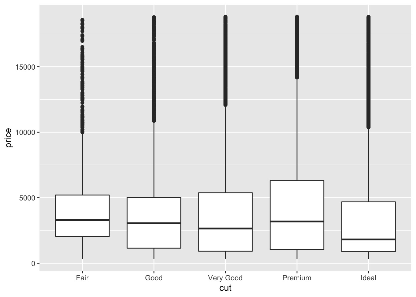
We see much less information about the distribution, but the boxplots are much more compact so we can more easily compare them (and fit more on one plot).
我们看到的关于分布的信息要少得多,但箱线图更紧凑,因此我们可以更轻松地比较它们(并在一个图中更适合)。
It supports the counterintuitive finding that better quality diamonds are cheaper on average!
它得到了一个违反直觉的发现,即质量更好的钻石平均更便宜!
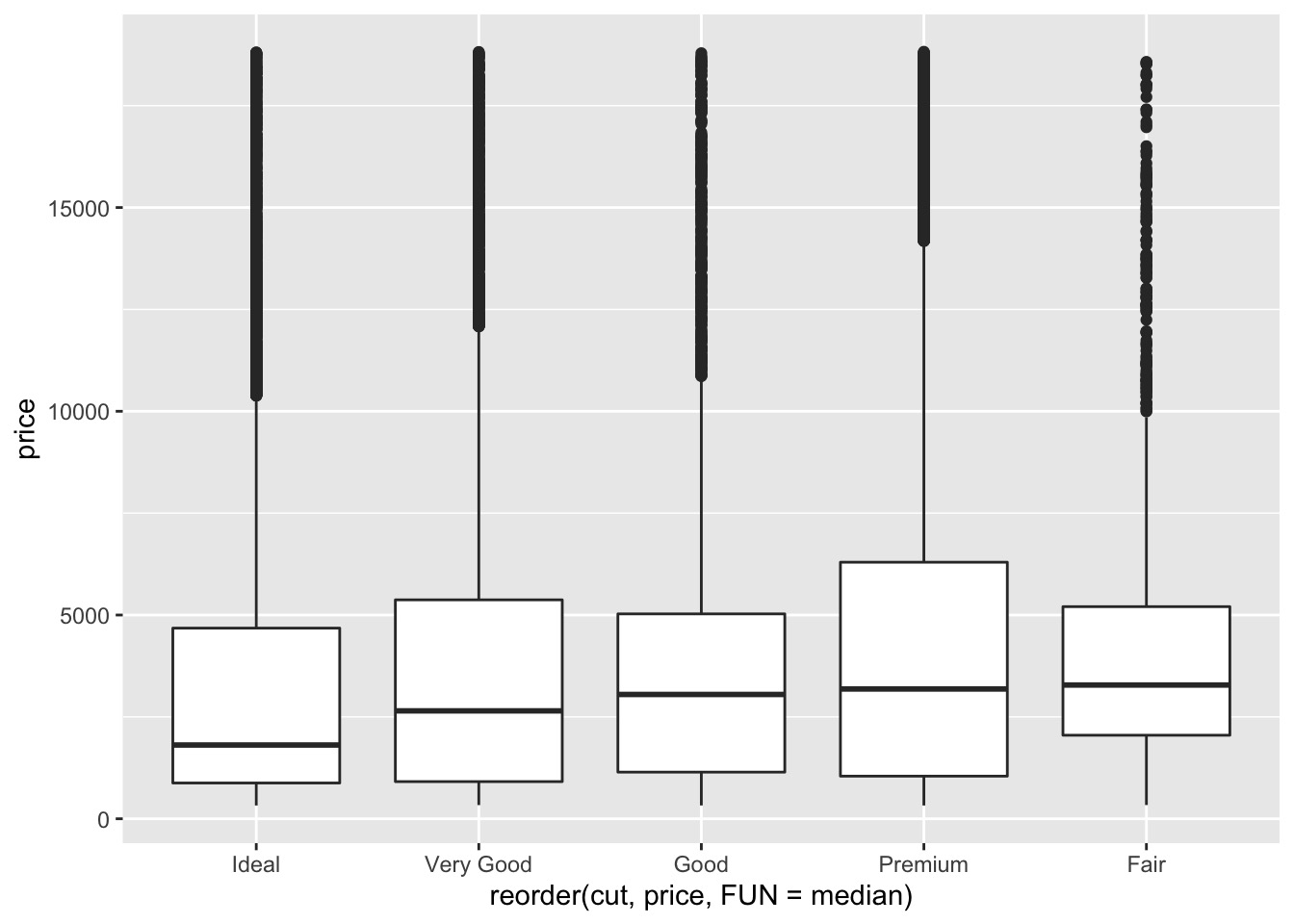
To make the trend easier to see, we can reorder cut based on the median value of price :
为了使趋势更容易看到,我们可以根据 price 的中值重新排序 cut :
ggplot(data = diamonds) + | |
geom_boxplot(mapping = aes(x = reorder(cut, price, FUN = median), y = price)) |
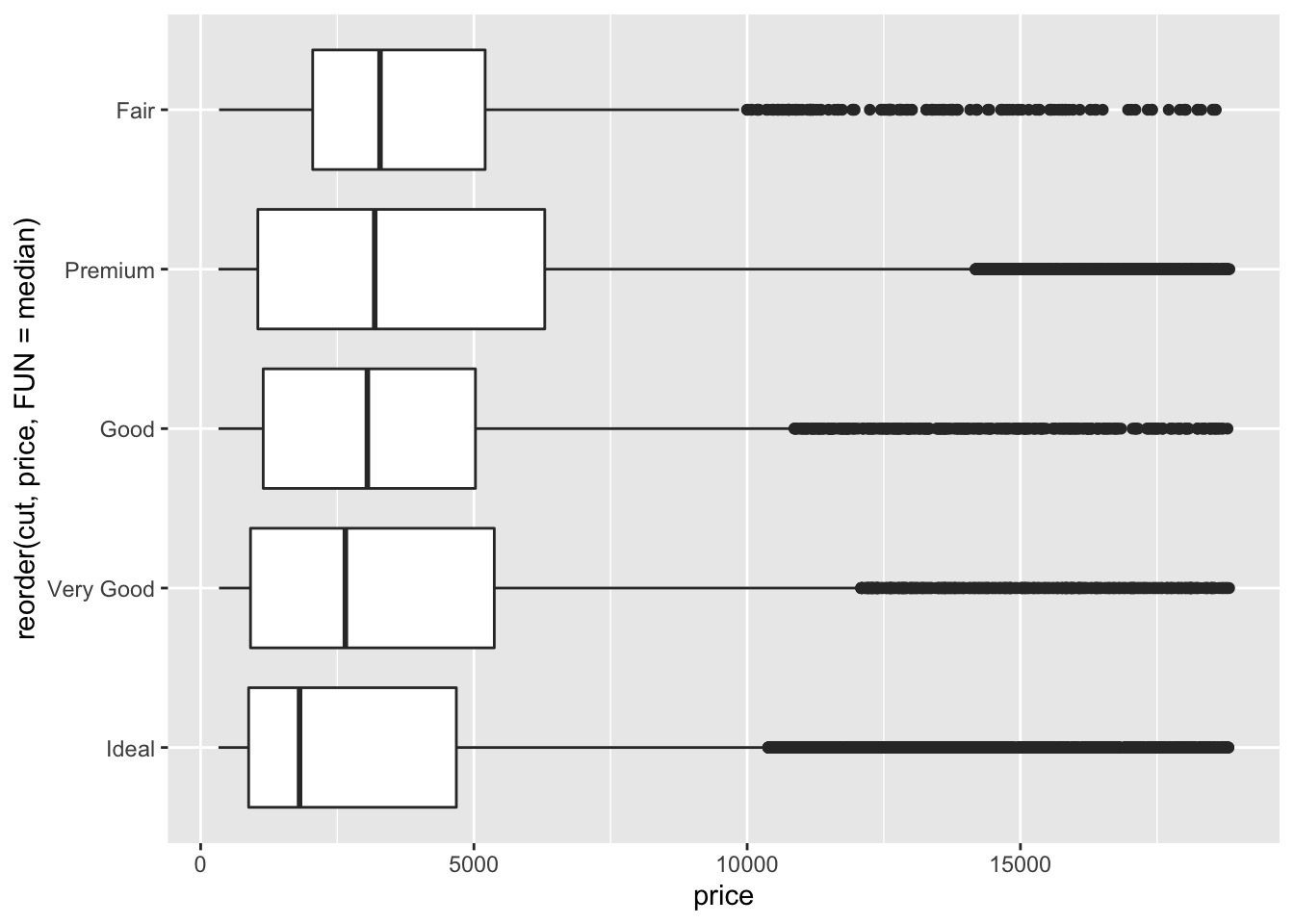
If you have long variable names, geom_boxplot() will work better if you flip it 90°.
如果你有很长的变量名, geom_boxplot() 将它翻转 90° 会更好地工作。
You can do that with coord_flip() .
可以用 coord_flip() 做到这一点。
ggplot(data = diamonds) + | |
geom_boxplot(mapping = aes(x = reorder(cut, price, FUN = median), y = price)) + coord_flip() |
# In-class Exercise: Investigate A Categorical and Continuous Variable by geom_boxplot
Please use
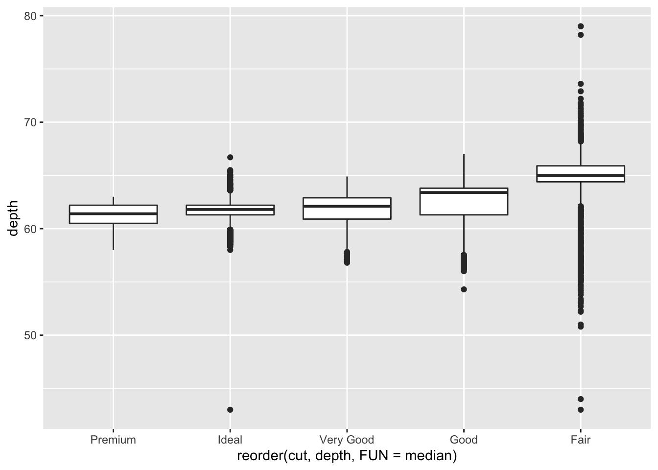
geom_boxplot()to investigate the relationship betweendepthandcut. You can choose to filp the boxplot or not.
请使用geom_boxplot()调查depth和cut之间的关系。可以选择是否翻转箱线图。ggplot(data = diamonds) +
geom_boxplot(mapping = aes(x = reorder(cut, depth, FUN = median), y = depth)) + coord_flip()
![]()
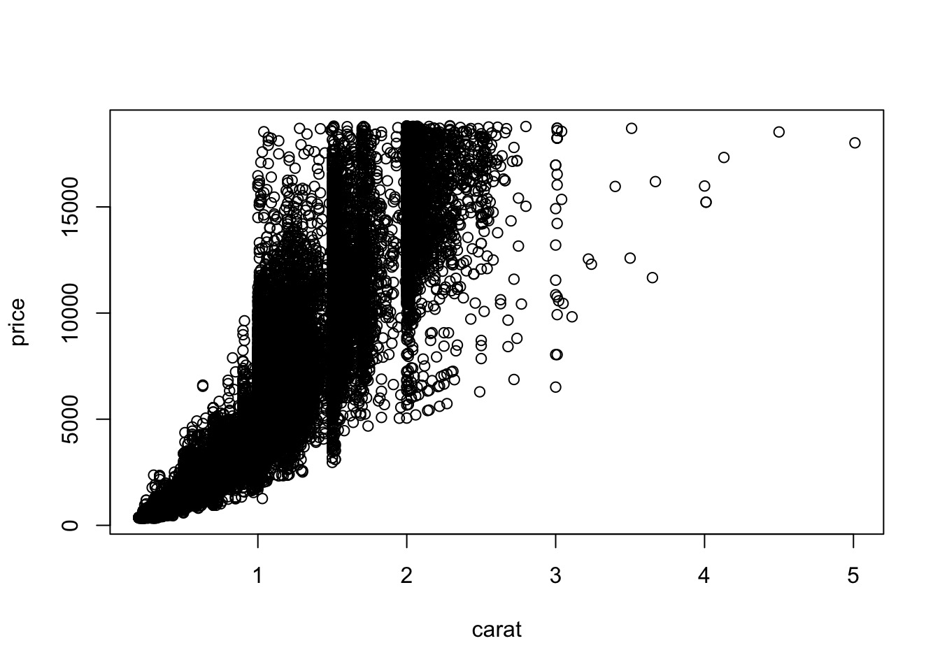
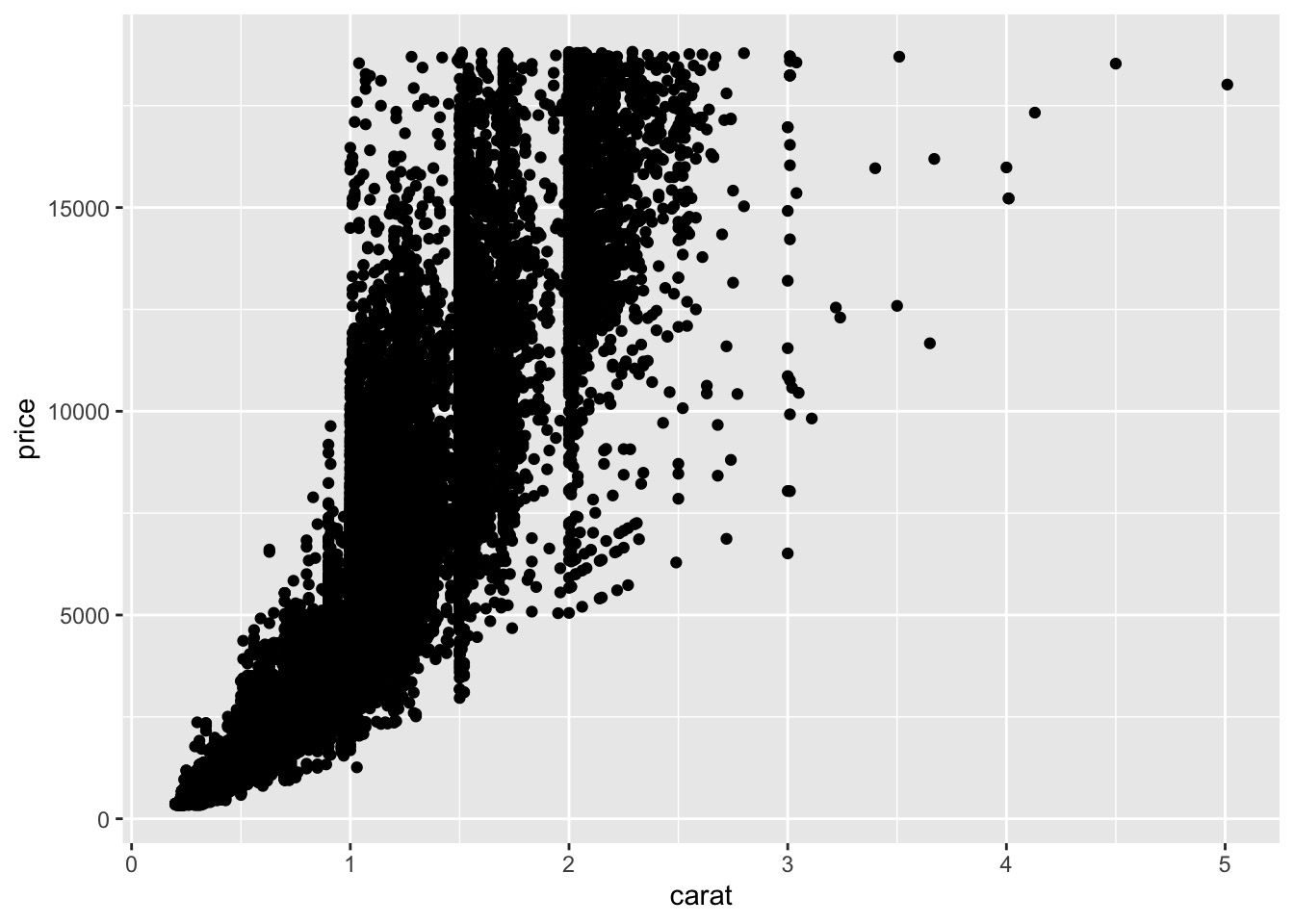
# geom_point() for Two Continuous Variables
使用 geom_point() 处理两个可数变量
We can use a regular plot to do that.
plot(price~carat,data = diamonds) |
Draw a scatterplot with geom_point() .
用 geom_point() 绘制散点图
ggplot(data = diamonds) + | |
geom_point(mapping = aes(x = carat, y = price)) |
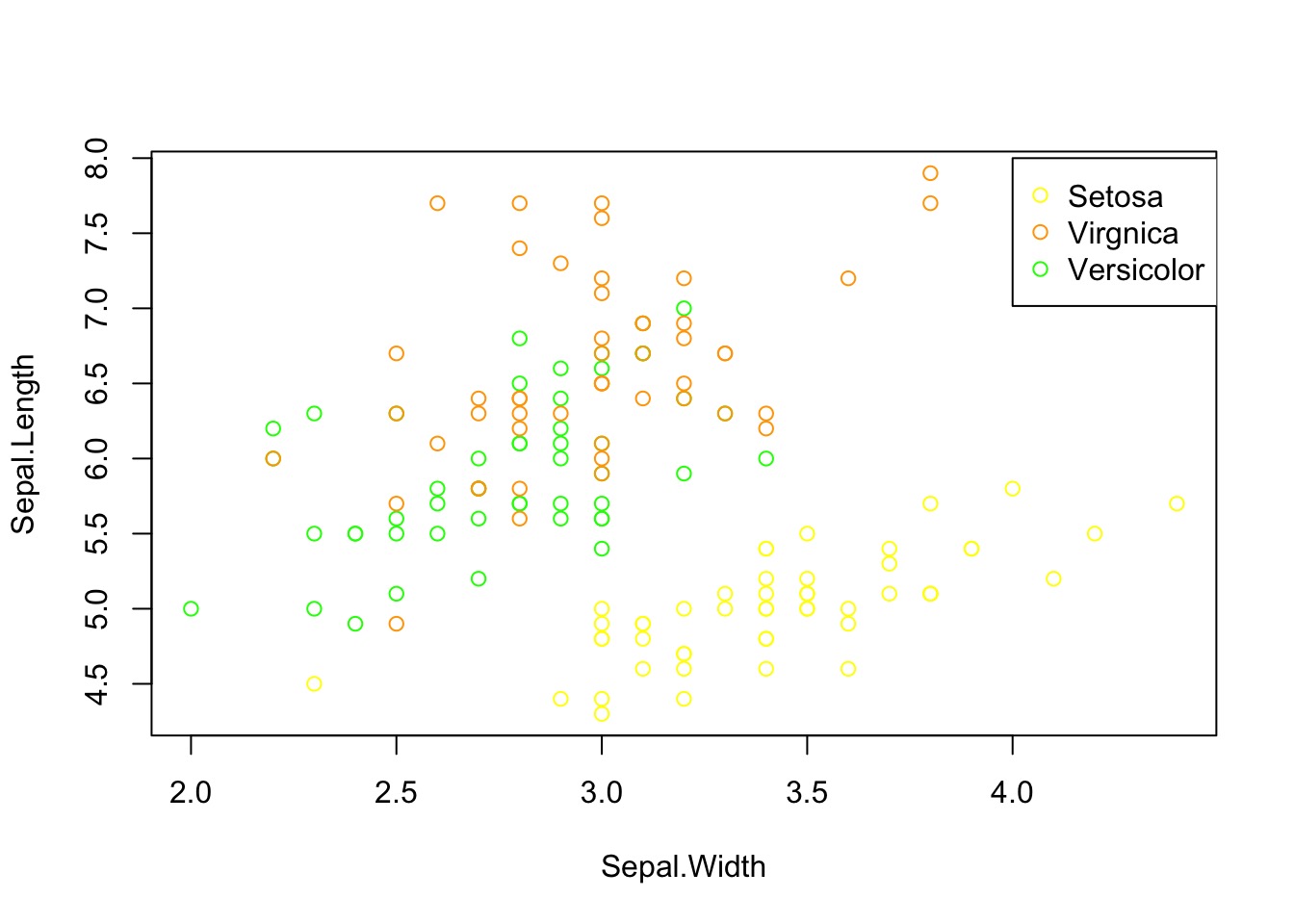
Let's play with iris dataset.
cols <-ifelse(iris$Species == 'setosa',"yellow",ifelse(iris$Species == 'virginica',"orange","green")) | |
plot(Sepal.Length~Sepal.Width,data = iris,col = cols) | |
leg.txt <- c("Setosa", "Virgnica","Versicolor") | |
col.txt <- c("yellow", "orange", "green") | |
legend(4,8,pch = 1, leg.txt, col = col.txt) |
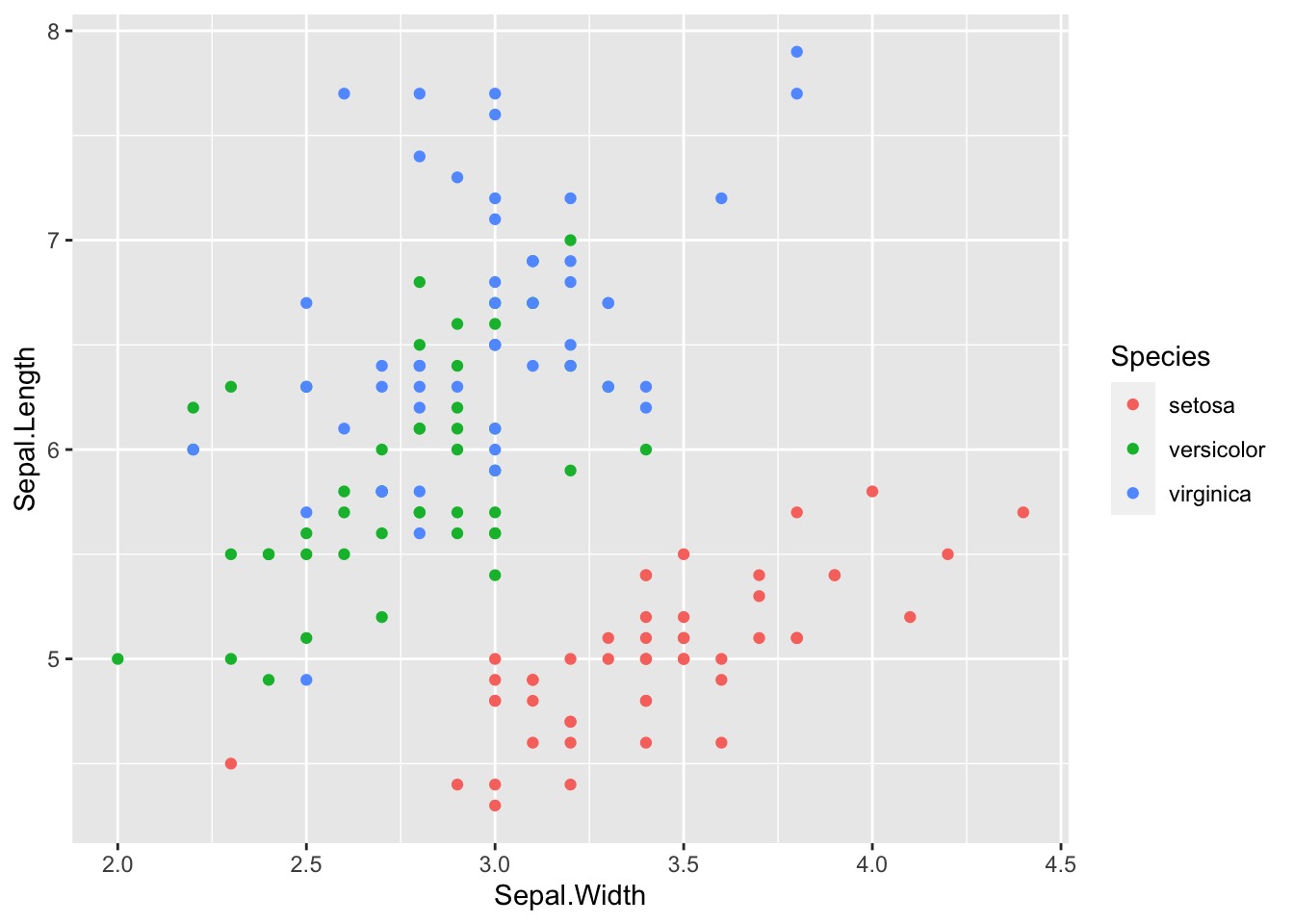
What about ggplot ?
ggplot(data = iris) + | |
geom_point(mapping = aes(x = Sepal.Width, y = Sepal.Length,colour = Species)) |
# In-class Exercise: Two Continuous Variables by geom_point()
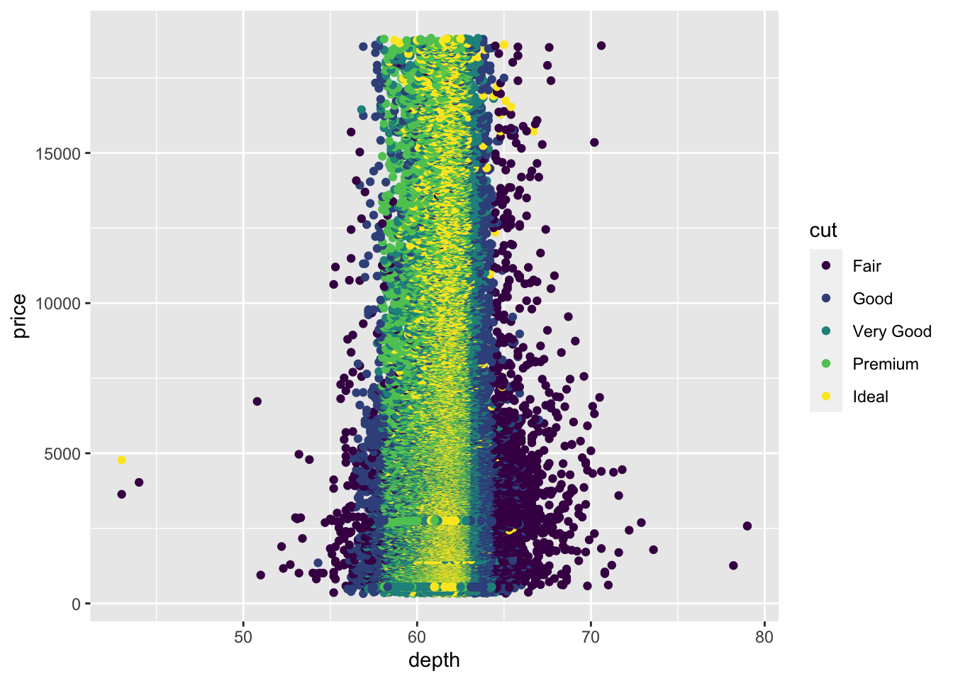
Please use
geom_point()to investigate the relationship betweendepthandprice.
请使用geom_point()调查depth和price之间的关系。ggplot(data = diamonds) +
geom_point(mapping = aes(x = depth, y = price,colour = cut))
![]()
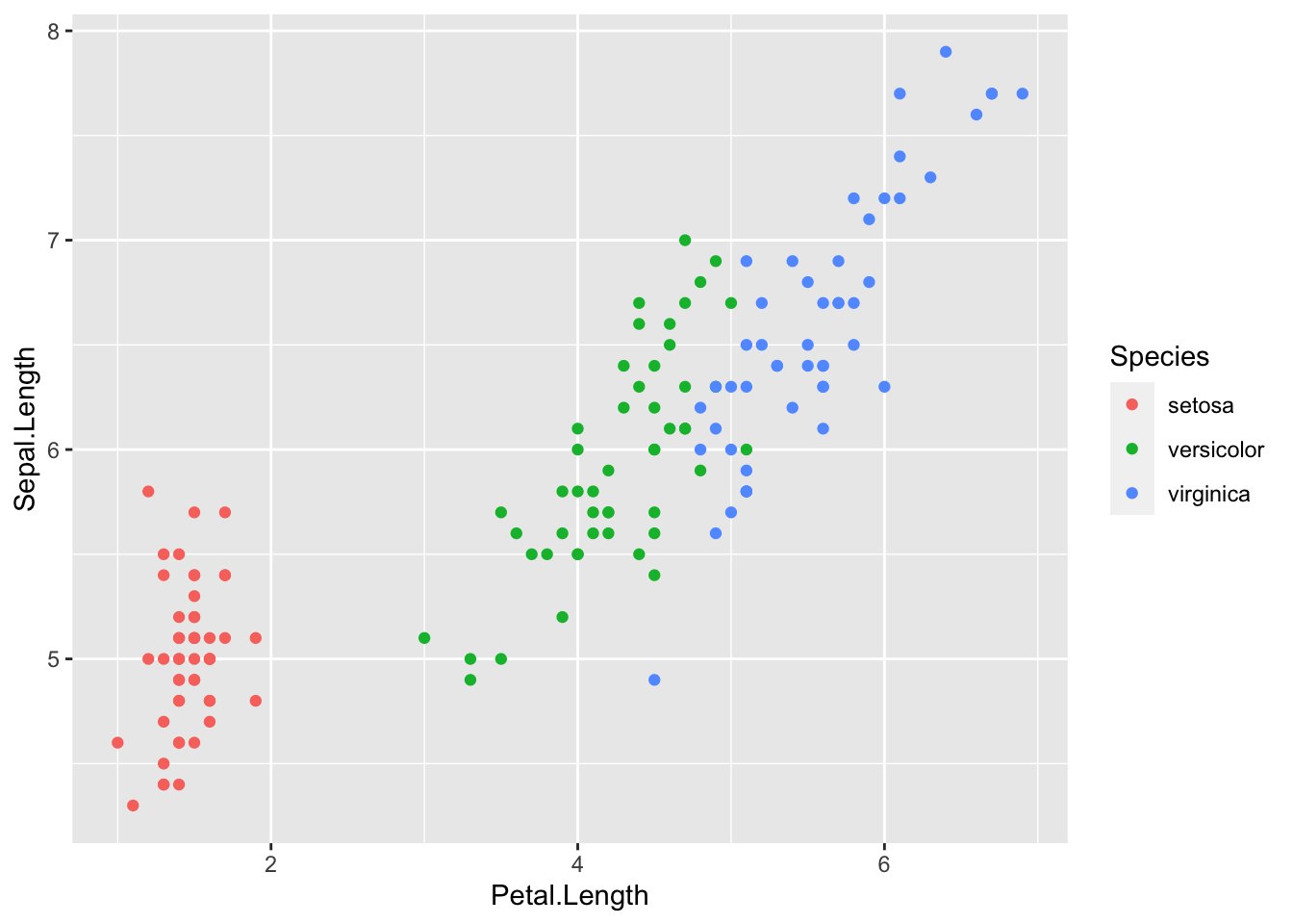
Please use
geom_point()to investigate the relationship betweenPetal.LengthandSepal.LengthwithSpeicesinIrisdataset.
请使用geom_point()在Iris数据集调查Petal.Length和Sepal.Length与Speices之间的关系的。ggplot(data = iris) +
geom_point(mapping = aes(x = Petal.Length, y = Sepal.Length,colour = Species))
![]()
# geom_bin2d() and geom_hex() for Two Continuous Variables
Another solution is to use bin.
另一种解决方案是使用 bin 封箱。
Previously you used geom_histogram and geom_freqpoly to bin in one dimension.
之前使用 geom_histogram 和 geom_freqpoly 在一维中封箱。
Now you’ll learn how to use geom_bin2d and geom_hex to bin in two dimensions.
现在将学习如何使用 geom_bin2d 和 geom_hex 在二维中封箱。
ggplot(data = diamonds) + | |
geom_bin2d(mapping = aes(x = carat, y = price)) |
# install.packages("hexbin") | |
# "hexbin" requires "stat_binhex" | |
ggplot(data = diamonds) + | |
geom_hex(mapping = aes(x = carat, y = price)) |
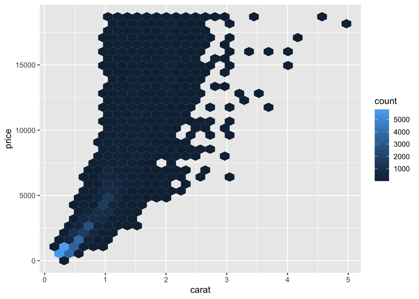
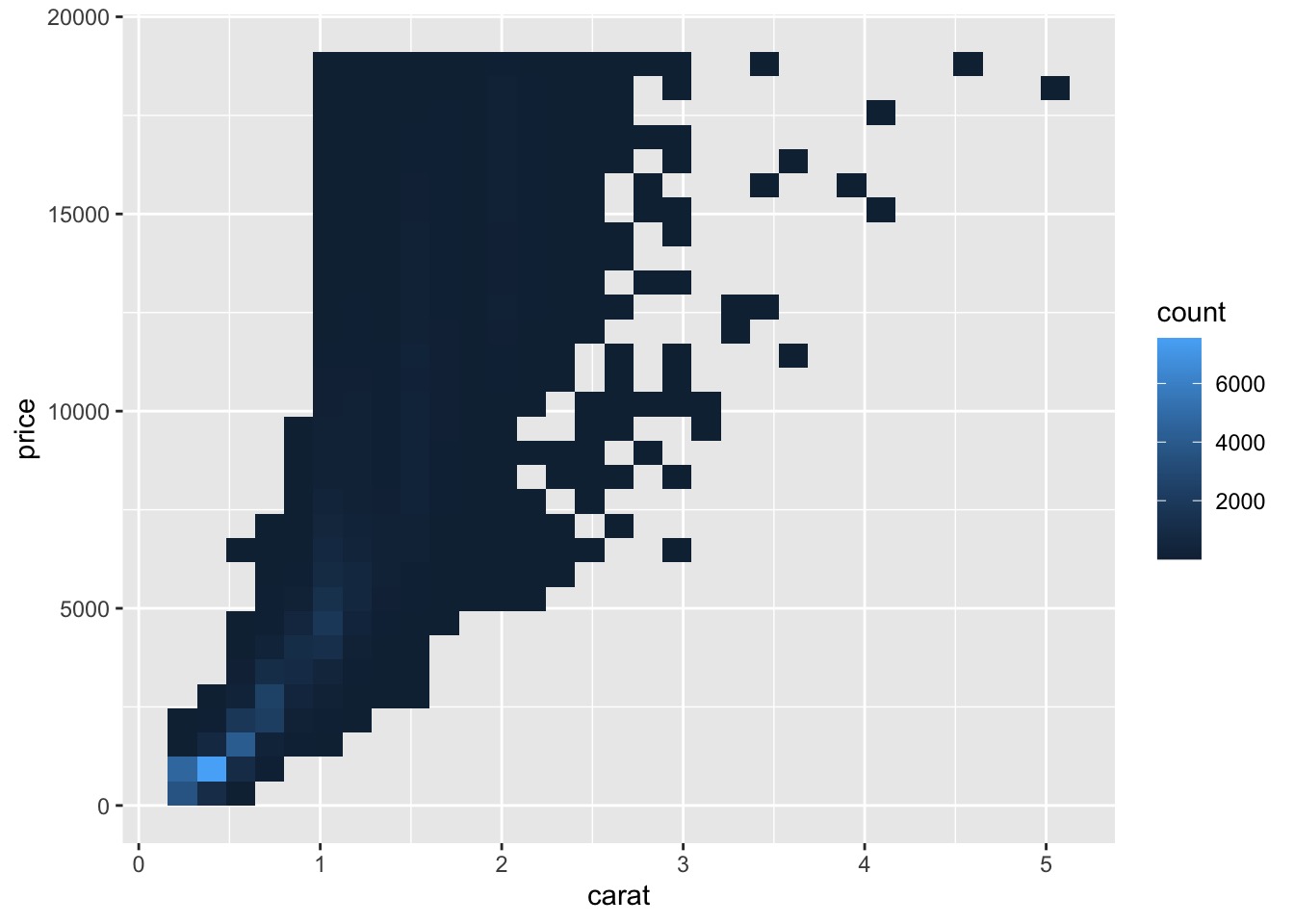
# In-class Exercise
Please use
geom_bin2d()to investigate the relationship betweendepthandprice.
请使用geom_bin2d()调查depth和price之间的关系。Please use
geom_hex()to investigate the relationship betweendepthandprice.
请使用geom_hex()调查depth和price之间的关系。
# geom_boxplot() for Two Continuous Variables
We can also bin one continuous variable so it acts like a categorical variable.
还可以将一个连续变量封箱,使其表现得像一个分类变量。
Then you can use one of the techniques for visualizing the combination of a categorical and a continuous variable that you learned about.
然后,可以使用其中一种技术,来可视化分类变量和连续变量的组合。
For example, you could bin carat and then for each group, display a boxplot:
例如,可以对 carat 进行分类,然后为每个组显示一个箱线图:
ggplot(data = diamonds, mapping = aes(x = carat, y = price)) + | |
geom_boxplot(mapping = aes(group = cut_width(carat, 0.1))) |
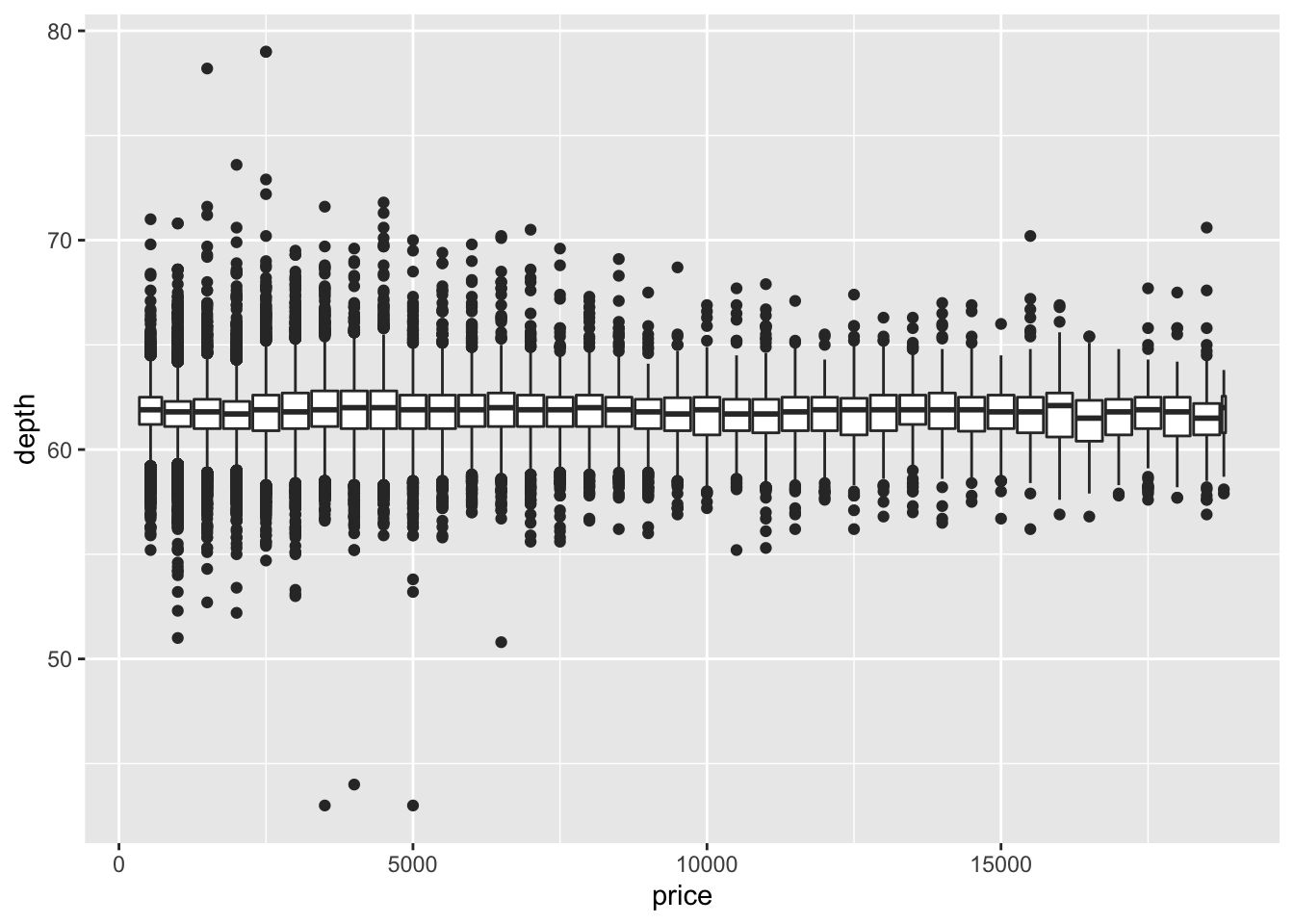
# In-class Exercise: Two Continuous Variables by geom_boxplot()
Please use
geom_boxplot()to investigate the relationship betweendepthandprice. How to choose the width?
请使用geom_boxplot()调查depth和price之间的关系。如何选择宽度?ggplot(data = diamonds, mapping = aes(x = price, y = depth)) +
geom_boxplot(mapping = aes(group = cut_width(price, 500)))
![]()
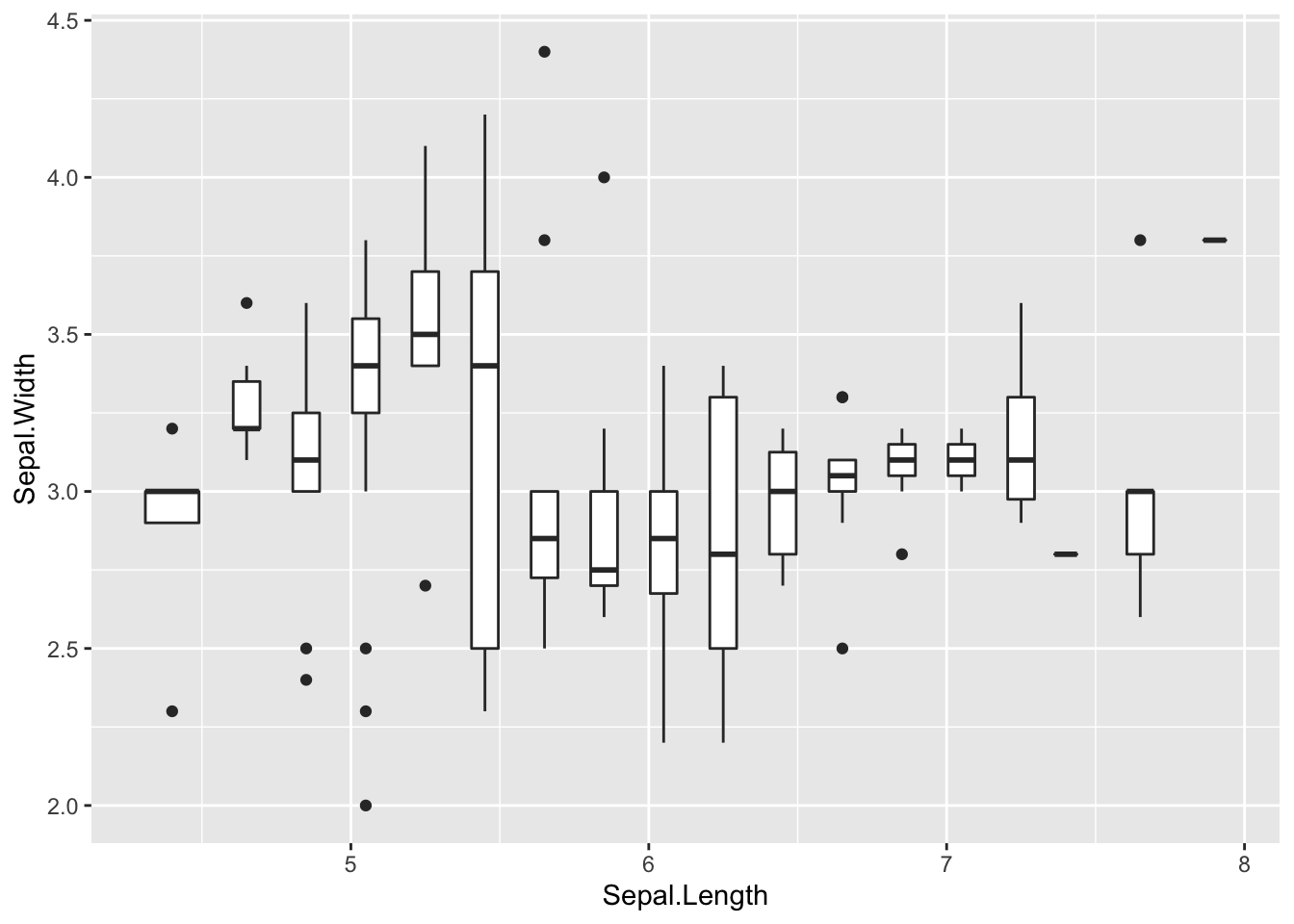
Please use
geom_boxplot()to investigate the relationship betweenSepal.LengthandSepal.Width. How to choose the width?
请使用geom_boxplot()调查Sepal.Length和Sepal.Width之间的关系。如何选择宽度?ggplot(data = iris, mapping = aes(x = Sepal.Length, y =
Sepal.Width)) +
geom_boxplot(mapping = aes(group = cut_width(Sepal.Length, 0.2)))
![]()
# References
- R for Data Science by Garrett Grolemund and Hadley Wickham, available freely online. https://r4ds.had.co.nz/fexploratory-data-analysis.html
- Data Science Using Python and R, Print ISBN:9781119526810 , Online ISBN:9781119526865. https://onlinelibrary.wiley.com/doi/book/10.1002/9781119526865